Our goal at Dyte is to help you build on live video and audio with ease, enabling you to launch faster. One of the most essential components that drive us towards this goal is our design. We want you to focus on your business, leave the rest to us.
Thus, our design approach is built upon the following principles:
- Maximum customization, minimum effort to reduce design effort on your end
- A multi-brand design system allowing it to be like your own app/website
- Designed to fit in your custom use-case and platform
Let’s see how we at Dyte are working on expanding the SDK capabilities via design to give you wings. (Dear Red Bull, please don’t sue us 🙏)
The current state: What could one do?
The SDKs that we launched a year ago were already revolutionary, being one of the first in the industry to offer branded video & audio call integrations. The UI customizations possible were:
- Brand colors
- Logo changes
- Adding and removing elements
Ability to toggle elements in the old SDK
The control here was limited with custom colors and logo changes. This was not enough!
Problems we wanted to solve
- Branding does not just mean logo and colors, it includes other elements of typography, UX, copy, border styles and much more.
- To not simply provide a standard Zoom/Google Meet like interface but the ability to be creative and make it match your use-case.
- Work across sizes - One should be able to embed Dyte or just use it in the sidebar. Our SDK should fit in.
- Designed with industry inclusion - Our SDKs are used across industries including Ed-Tech, Telemedicine, Remote Work, Social Commerce, Networking, Events, Gaming and Fitness.
- Component & layout level customization.
- Ability to expand: Take our system and expand it to what you want.
All this while following our principle of “Maximum customization, minimum effort” to not burden your team with design complexity.
A new system, a new approach
I've been amazed at how often those outside the discipline of design assume that what designers do is decoration. Good design is problem solving. - Jeffrey Veen
To solve the above problems for our new SDKs, we had to take an atomic design system approach for our design. But to fit our requirement of keeping design decisions simple & customizable for our users, we combined it with design tokens.
Atomic Design ⚛️
Remember those chemistry lessons in school? We might need them now. Atomic Design is a methodology created by Brad Frost that allows one to form a building block structure for components of a design system. This methodology has been given the name Atomic Design because its very idea is based on Chemistry and the study of the composition of matter. You can read more about it here.
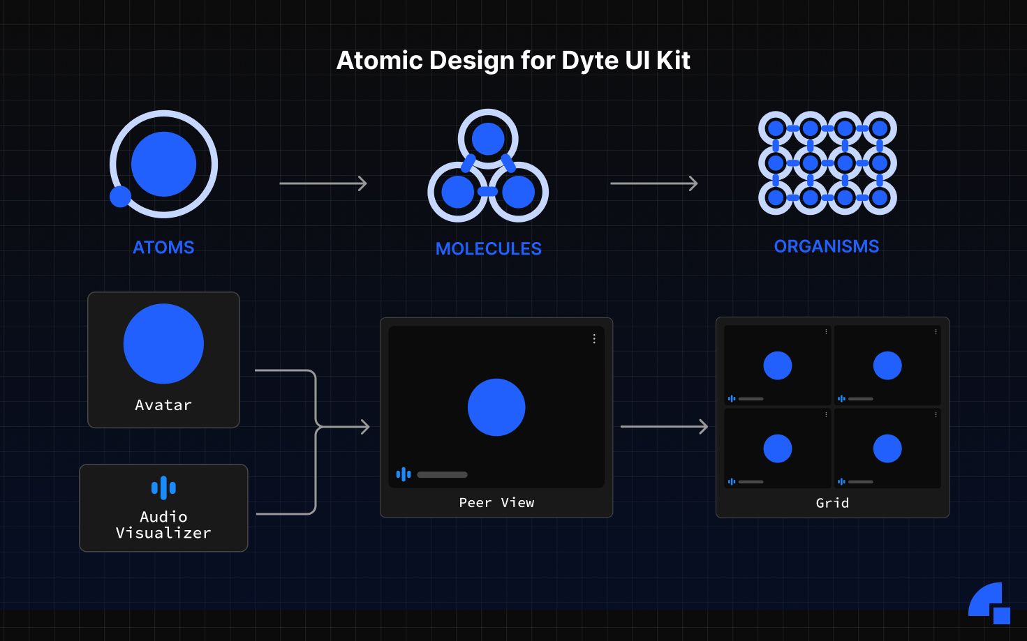
Below is an example of how our components are structured into Atoms, Molecules and Organisms to offer a consistent and scalable design system.
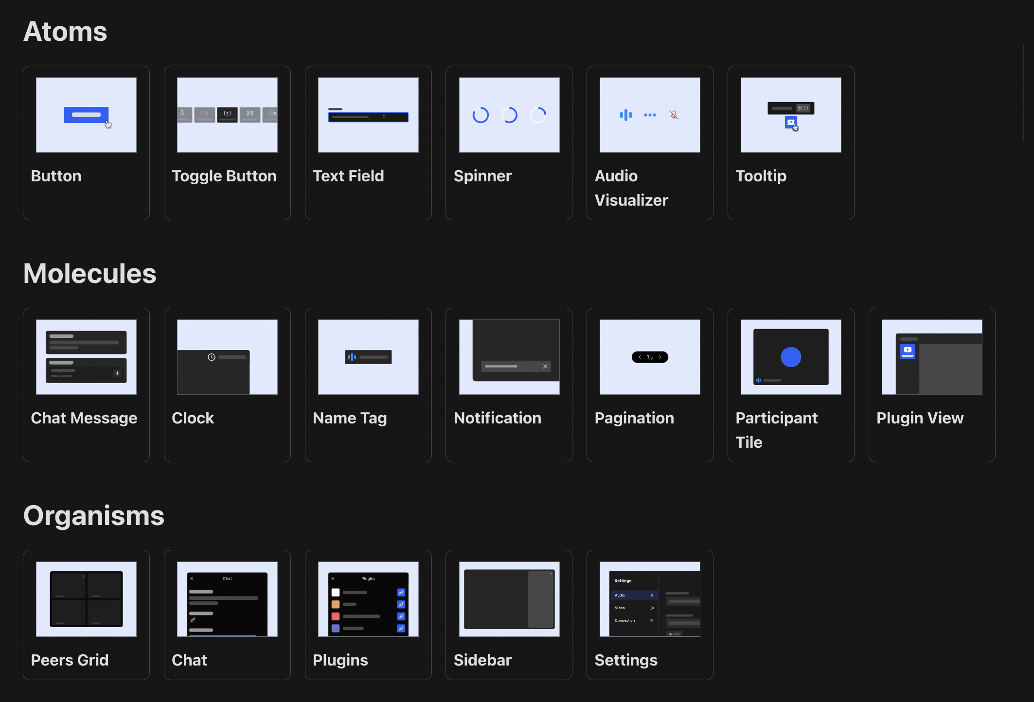
Below is a glimpse of how we have structured and also exposed our components at Atom, Molecule and Organism levels for the meeting interface.
Dyte Design Tokens!
Design tokens are a central collection of tiny pieces of UI information that store design-related information such as colors, fonts, spaces, animations, etc. For a layman's explanation to developers, you can consider these as global constants being reused wherever needed. Essentially abstracting the design decisions at a separate layer from code. Design token were established by Salesforce but today they are used by Adobe, Salesforce, Firefox, Spotify, Shopify and many more. Even the latest Material 3 design system by Google and Android 12 utilize design tokens.
What can you do with tokens in our SDKs:
- 🎨 Colors: a set of brand color, text color, background color and video background color allows you to get your own colors set.
- 🔠 Font & styles: Choose a google font or a custom font with your style control.
- 💠 Icon pack: Oh yes! You can now change all icons with a single line.
- 🔘 Border radius: Want a sharp, rounded or soft look. You got it.
- 〰️ Border thickness: Hate or love borders, choose what you want.
- ↔️ Spacing: We offer you the space you want.
- 🈺 Language: Choose from the available or add support for any within mins.
- 📺 Video parameters: Choose the ratio and style you want.
The tokens act as a Single Source of Truth (SSOT) for the Dyte design system and can be changed to your needs at Dyte. Every component uses these tokens to style itself and you can even override it. A preview of how a few tokens work:
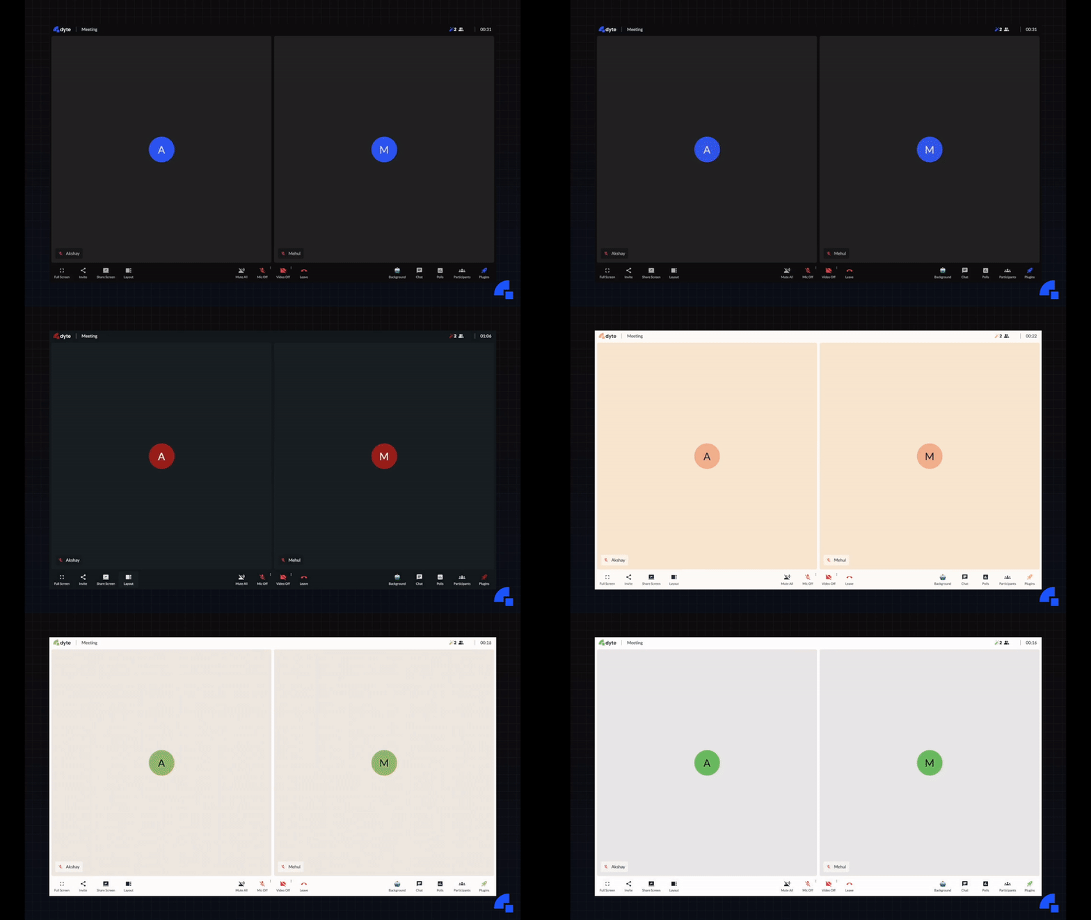
High level demo of how design tokens affect the UI
These tokens can be used to match your branding without being limited to colors.
The design tokens and atomic design are just the approaches we took, but we have reworked our design system step by step with detail to help you customize, scale and provide a flawless UX experience to your customers.
What is possible now?
You think and we can make it happen! Reach out to us for early access. Just a glimpse below:
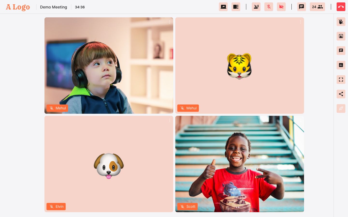
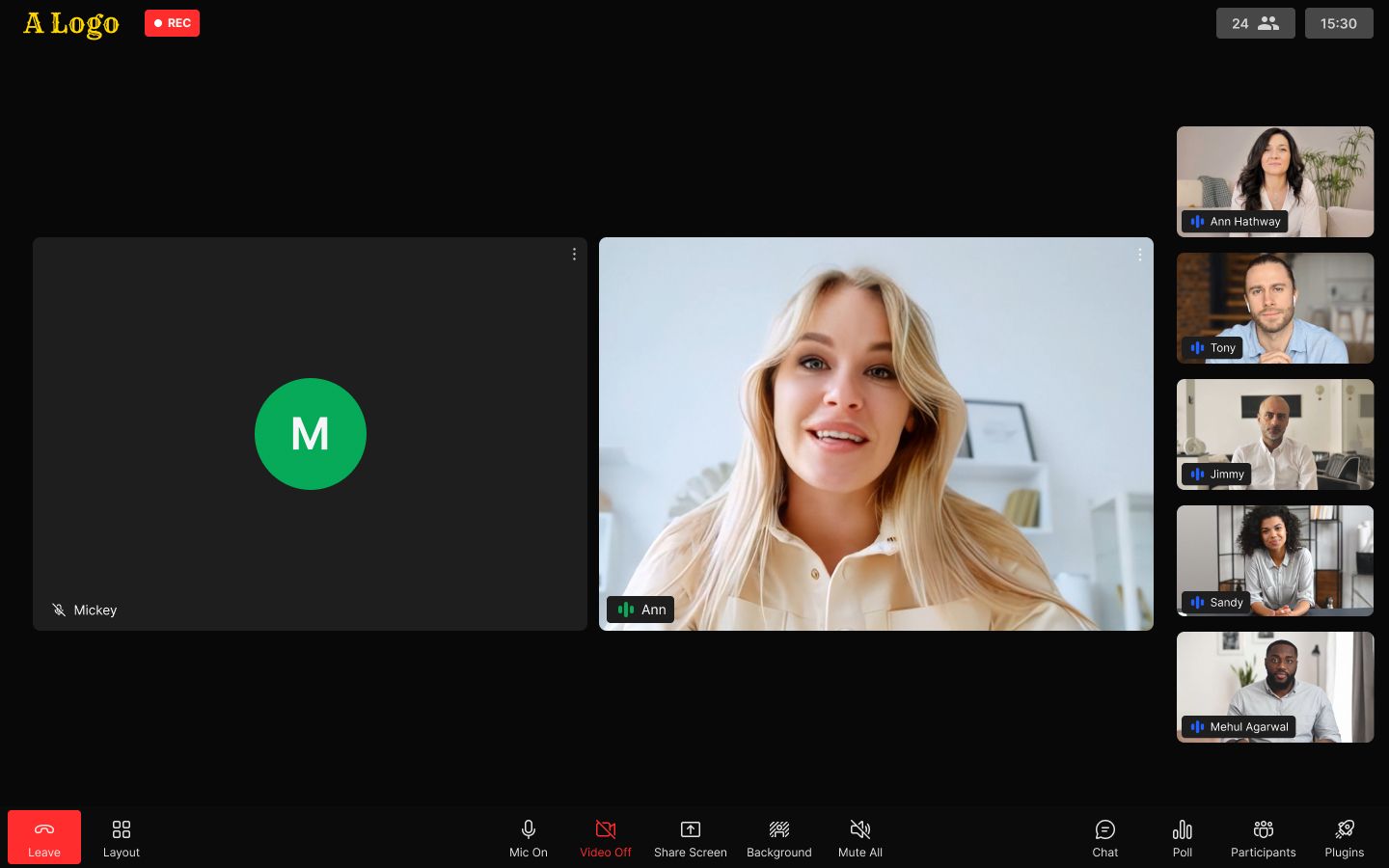
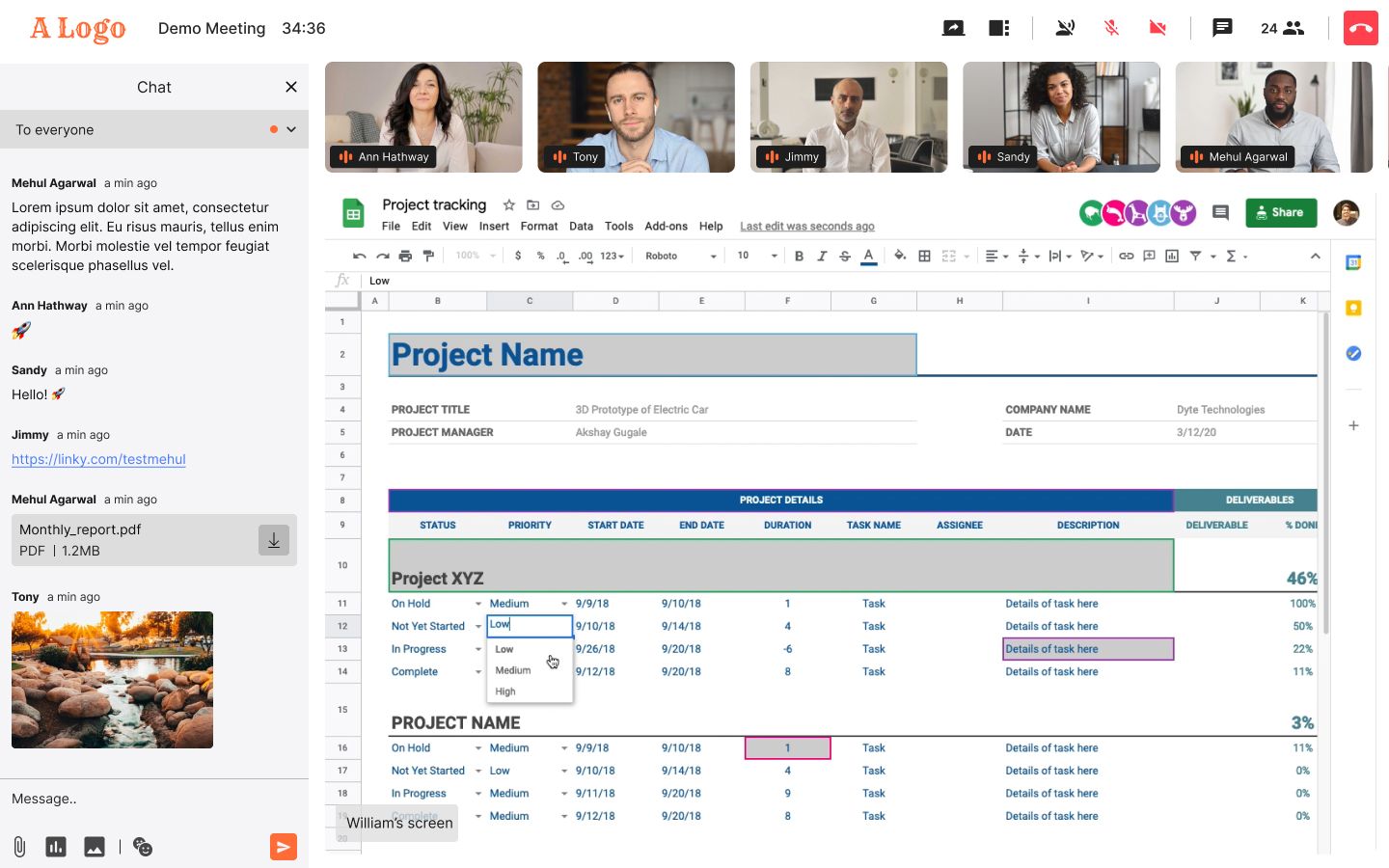
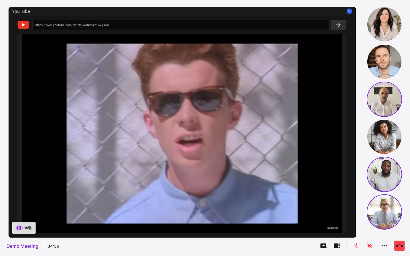
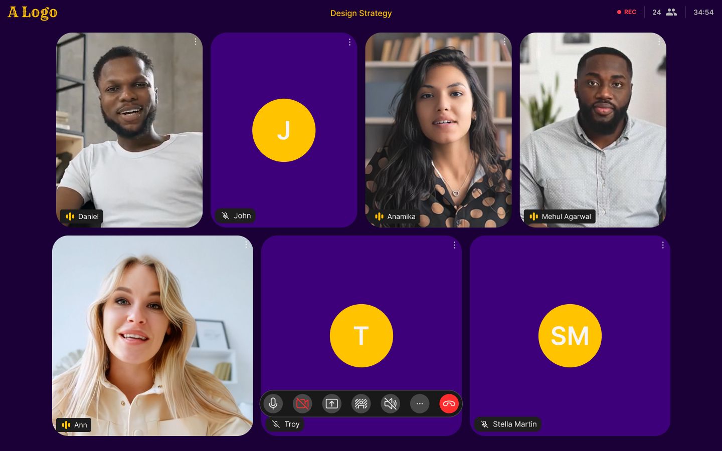

We’ll talk about how we built these capabilities and how to utilize them in our new SDKs in the blog posts coming up next.
Stay tuned.
If you haven’t heard about Dyte yet, head over to https://dyte.io to learn how we are revolutionizing live video calling through our SDKs and libraries and how you can get started quickly on your 10,000 free minutes which renew every month. If you have any questions, you can reach us at support@dyte.io or ask our developer community.

