Dyte's UI Kit provides an easy way to customize the control bar for your online meetings. The control bar is an essential part of any meeting platform as it enables users to access various meeting controls such as audio and video settings, screen sharing, recording, and more.
Dyte's UI Kit provides all the necessary UI components to build a seamless meeting experience and allows complete customization of all its UI Kit components. In this blog, we will walk you through the steps required to customize the control bar for your meetings using Dyte's Web SDK.
Installing Dyte's Web SDK
To get started with customizing the control bar for your meetings, you need to integrate Dyte's Web SDK into your web application. You can do this by following the instructions provided in the Dyte Web SDK documentation.
npm install @dytesdk/react-ui-kit @dytesdk/react-web-core
Once you have successfully integrated the SDK, you can move on to the next step.
Understanding the anatomy of UI Kit
You can create a full fledged meeting experience using just one UI component. The DyteMeeting the component contains all the necessary features and subcomponents to create a default meeting UI.
import { useDyteClient } from '@dytesdk/react-web-core';
import { DyteMeeting } from '@dytesdk/react-ui-kit';

function App() {
  const [client, initClient] = useDyteClient();

  useEffect(() => {
    initClient({
      authToken: '<auth-token>',
      defaults: {
        audio: false,
        video: true,
      },
    });
  }, []);

  return (
    <DyteMeeting meeting={client} />
  );
}
The DyteMeeting component can be broken down into 3 major subcomponents:
- Dyte Header: The Dyte Header is a UI component provided by Dyte's UI Kit that displays information about the meeting, such as the meeting title and the participant count.
- Dyte Grid: Dyte's Grid component is a UI component provided by Dyte's UI Kit that is used to display the video feeds of meeting participants. The Grid component automatically adjusts the layout of the video feeds based on the number of participants in the meeting. This allows for a seamless meeting experience regardless of the number of participants in the meeting. The grid component has multiple layouts and variants. Read more about it here.
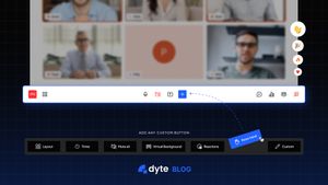
- Dyte Control Bar: Dyte's Control Bar is a UI component provided by Dyte's UI Kit that is used to display various controls for online meetings. The Control Bar can be customized using Dyte's UI Kit to match the branding of your web application. By customizing the Control Bar, you can easily show or hide controls, add or remove buttons, and more to provide a better meeting experience for your users and make your online meetings more productive. The control bar is made up of
DyteControlbarButton, a skeleton component used for composing buttons.
Let’s build a hand raise feature
To understand how you can customize a control bar, Let's build a hand raise feature.
What we want to achieve: Add a custom button to the control bar that allows users to raise their hand during the meeting. This button should also notify other users when a user has raised hand.
Let’s create a basic meeting setup. It is important to implement the following components:
DyteParticipantsAudio
This component is required for audio playback. You will not be able to hear audio without this component.
This component also displays a dialog if the browser throws an auto play error, requiring user interaction to allow audio to be played.
DyteNotifications
This component is required for receiving notifications. If you don't have this component, you won't be notified of events like network disconnection or poor network.
If you have not configured this component, you'll also not be able to leave the meeting.
Read more about integration prerequisites here.
Our basic meeting setup consists of two files App.jsx and App.css.
Here’s what the App.jsx should look like
import React, { useEffect, useState } from 'react';
import { useDyteClient, DyteProvider } from '@dytesdk/react-web-core';
import {
  DyteParticipantsAudio,
  DyteNotifications,
  DyteGrid,
  DyteMicToggle,
  DyteCameraToggle,
  DyteSettingsToggle,
  DyteHeader,
} from '@dytesdk/react-ui-kit'
import './App.css';

useEffect(() => {
    initClient({
      authToken: '<auth-token>',
      defaults: {
        audio: false,
        video: true,
      },
    });
 }, []);

if (!client) return (<div>Loading Dyte Meeting...</div>);

return (
  <div className="dyte-meeting">
  <DyteProvider value={client}>
      <DyteParticipantsAudio meeting={client} />
      <DyteNotifications
        meeting={client}
        config={{
          config: {
            notifications: ['chat', 'participant_joined', 'participant_left'],
            notification_sounds: ['chat', 'participant_joined', 'participant_left'],
            participant_joined_sound_notification_limit: 10,
            participant_chat_message_sound_notification_limit: 10,
          },
        }}
      />
      <DyteHeader meeting={client} />
      <div className="grid-container">
        <DyteGrid meeting={client} style={{ height: '100%' }} />
      </div>
      <div class="controlbar">
        <DyteMicToggle meeting={client} />
        <DyteCameraToggle meeting={client} />
        <DyteSettingsToggle meeting={client} />
      </div>
  </DyteProvider>
  </div>
);
}

export default App;
Here’s what the App.css should look like:
html {
 height: 100vh;
 width: 100vw;
 margin: 0;
}

.grid-container {
  display: flex;
  flex-direction: row;
  flex-grow: 1;
}

.controlbar {
  height: fit-content;
  display: flex;
  flex-direction: row;
  align-items: center;
  justify-content: center;
}

.dyte-meeting {
  display: flex;
  height: 100vh;
  width: 100vw;
  background: black;
  flex-direction: column;
}

.active-button {
  color: red;
}
Once we have our basic meeting setup we can now start building the hand-raise feature.
Step 1: Add a custom control bar button
We import the DyteControlbarButton and create a state to manage the UI
const [handRaised, setHandRaised] = useState(false)
<DyteControlbarButton
    label="Raise Hand"
    icon={handSvg}
    onClick={raiseHand}
    className={handRaised ? "active-button": ""}
  />
Step 2: Implement the raiseHand function.
When a user clicks the control bar button we want to broadcast a message to all peers in the meeting. We can use the broadcast API exposed by web-core for this.
The broadcastMessage method takes in two parameters, a type, and a payload. We pass the peer’s ID and display name in the payload.
const raiseHand = async () => {
  await client.participants.broadcastMessage('hand-raise', {
    id: client.self.id,
    name: client.self.name,
  })
  setHandRaised(!handRaised);
}
Step 3: Listen for the broadcasted message. Each peer will listen to the broadcastedMessage event. When the event is fired we send a notification to the user using the sendNotification method exposed by @dytesdk/react-ui-kit.
useEffect(() => {
    if (!client) return;
    client.participants.on('broadcastedMessage', ({payload}) => {
      const notificationObj = {
        id: new Date().getTime().toString(),
        message: `Hand Raised by ${payload.name}`,
        duration: 3000,
      }
      sendNotification(notificationObj, 'message')
    })

    return () => {
      client.participants.removeAllListeners('broadcastedMessage');
    }
  }, [client])
The power of customization
With Dyte’s customizable UI Kit, you can easily manage controls, add or remove buttons, create custom controls, and do much more with just a few lines of code. This will help you provide a better meeting experience for your users and make your online meetings more productive.
If you have any queries, feel free to reach out to us. We're always happy to assist you. Don't forget to tweet and show us what you create!

