Developers don't like to be sold to and told what to use. Instead, they want to discover and play around with a tool before they begin to use it. When developers come across a shiny new product, some of the key questions they would typically have are:
- What does this product exactly do and what is the underlying architecture?
- What are the steps I need to follow to get started, and how much time will it take?
- How can I find information about specific use cases and exceptions?
- How can I debug or get help in case I run into any issues?
Documentation is usually the section which a developer would visit to get most of the above questions answered in a detailed yet simplified manner. It is the main source of information that addresses a technical audience and expands on all the product features and how to use them. Your documentation is your user manual and is one of the most critical sections to get right as it is the first touchpoint where a developer gets a look and feel of the user-friendliness of the product.
A lot of organizations ask their developers to evaluate and estimate the time and effort required to get output from a product before they proceed to sign up and a developer would only be able to do this given the right documentation and guides to tell them about what is required to be done. Post signup, a good set of documentation then helps the intended audience navigate through a complex set of choices, options, and features and eventually go live.
Even if the customers are ready to give you a shot and the functionality is available, customers could really be lost without proper documentation. Someone could build an awesome product with boatloads of features but without a good documentation website, it would be difficult for the customers to know about those features & how to use them.
Therefore, documentation can really make the difference between converting and losing a prospective user, and today we wanted to share our views on what we believe are some aspects of well-thought documentation.
Our guide to make documentation user friendly
When we say we are "building for developers", we mean it. There are no right or wrong ways to write good documentation, but there certainly are pitfalls that can reduce the usability and comprehensibility of a doc. We took a deep, hard look at how we can build the best documentation across all of the internet, and establish them as "best practices".
We also looked at some of the existing good documentations from across various developer websites and really learned a lot from them, but given the task, we had at hand, of creating a platform that could document web APIs, front-end SDKs with visual elements, and front-end SDKs without visual elements - we couldn't find a single platform or reference which could satisfy all our requirements.
Keeping this in mind, we began designing our revamped docs a couple of months back. We took a bold step of imagining a whole new system and structure, and we are kinda proud of the outcome (head here to check it out!). Needless to say, it is quite subjective and we are always looking for feedback to make improvements on this so feel free to get in touch.
Without further ado, here is a glimpse of what we have come up with.
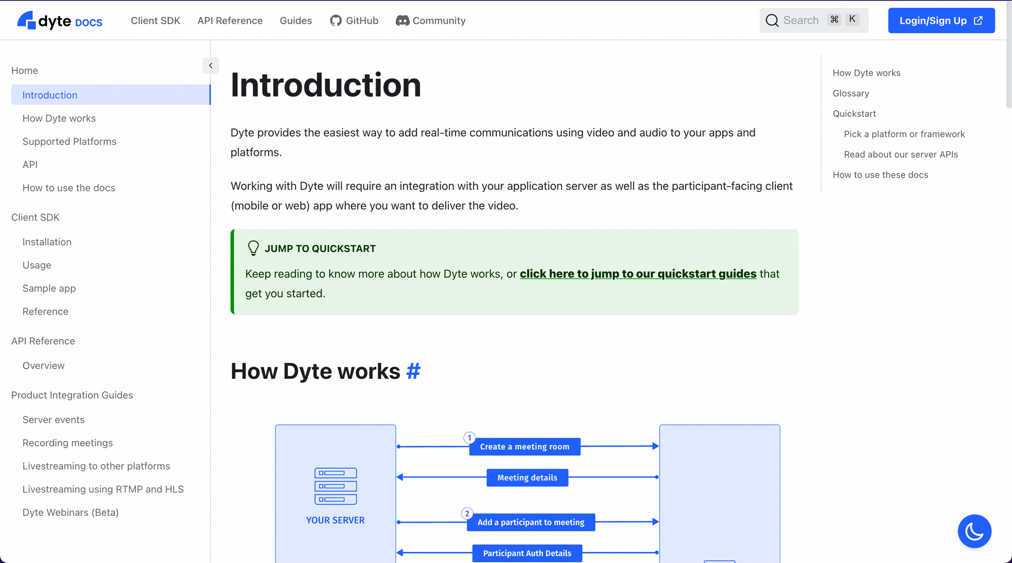
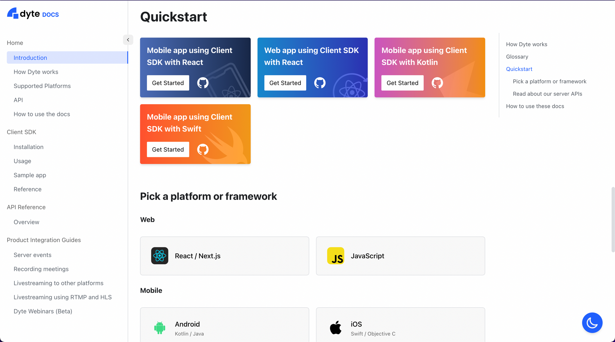
Informative landing page
The first thing someone should see when they click on the link to documentation should be a landing page specifically curated for docs. It should welcome the developer with an introduction about your product, and then show the developer a glimpse of what all information is available, what to expect while exploring, and how to get to the bits they are most concerned about.
Navigation
The next thing that becomes important is for the developers to be able to navigate and reach where they want if the highlighted links do not entirely serve their purpose. The navigation and search should be organized in a way that makes logical and intuitive sense to the developers, while also not making it overwhelming to look for something specific among a huge list of options.
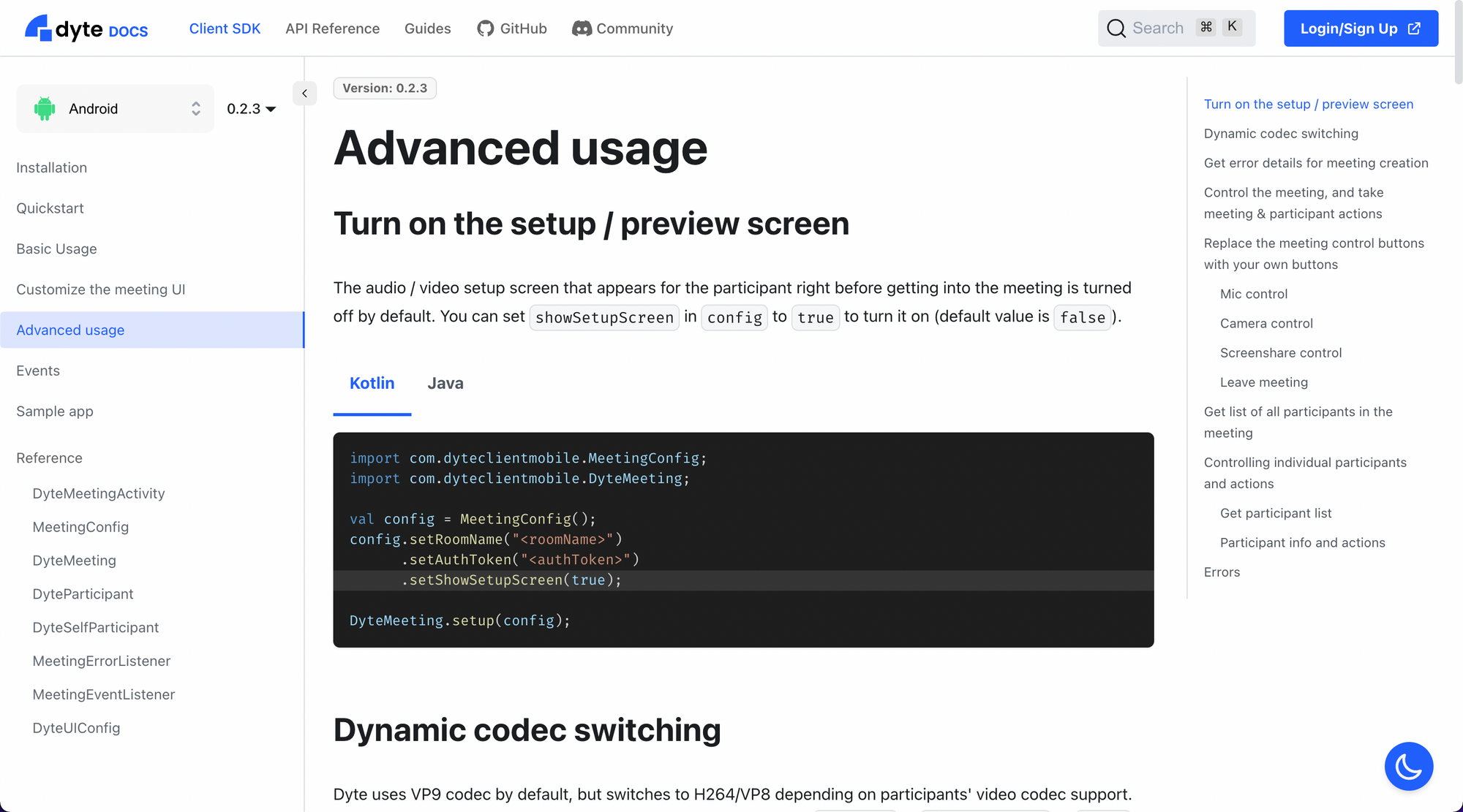
The top navigation bar leads to different options that make sense for a developer to explore but are not immediately important. Notice there's also an option to run a text search.
The left sidebar helps the developer jump between logically sequenced pages of information, grouped under the same category.
The right sidebar lists the sections on a page, which are accessible at a click.
So the whole idea becomes - search across the website or go to different sections via the top bar, go to related pages and next steps via the left bar, and to sections within a page using the right bar - which makes the site completely navigable and accessible.
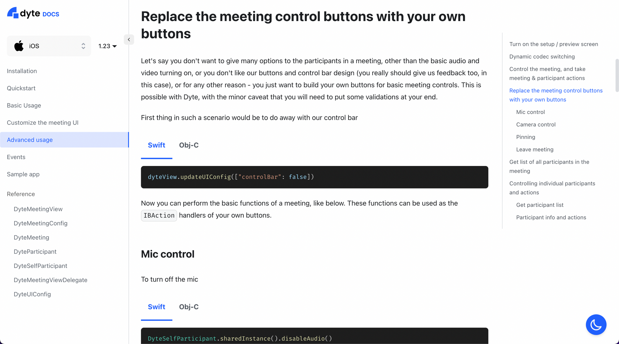
While we are on the topic of decent navigation, we had to also think about the variety of platforms we offer our products on and versions of those products. We offer an SDK for all commonly used front-end platforms, which gives us the unique opportunity to leverage the best features offered by the platform but also increases the number of SDKs we have to write about. We wanted them to be easily discoverable and make cross-referencing between platforms easier. The URL structure would also play an important role in this since the transition from one platform's docs to another should be as seamless as possible. We played around with designs and router settings to finally come up with this. As you can see, switching between different platforms for the same function retains the same URL structure and maintains the position on the page (which we think is pretty 🆒).
Detailed explanations
Clear, in-depth explanations are the core of any good documentation. Once the developer knows what to look for and reaches there, what they read and comprehend becomes the most important thing to focus on. In all honesty, this was the first thing that we set out to fix about our previous docs but then we got to thinking about the whole experience for the developers, and that motivated us to redo the entire docs experience. Combined with easy-to-copy code snippets, this makes the documentation a breeze to use.
Complete references
Many times, developers may not want to look at the complete explanations of each feature, but only need a quick reference or reminder. A good reference section can help you address this. This way, the developers can quickly cross-check their code against the intended functionality and debug as required.
Search
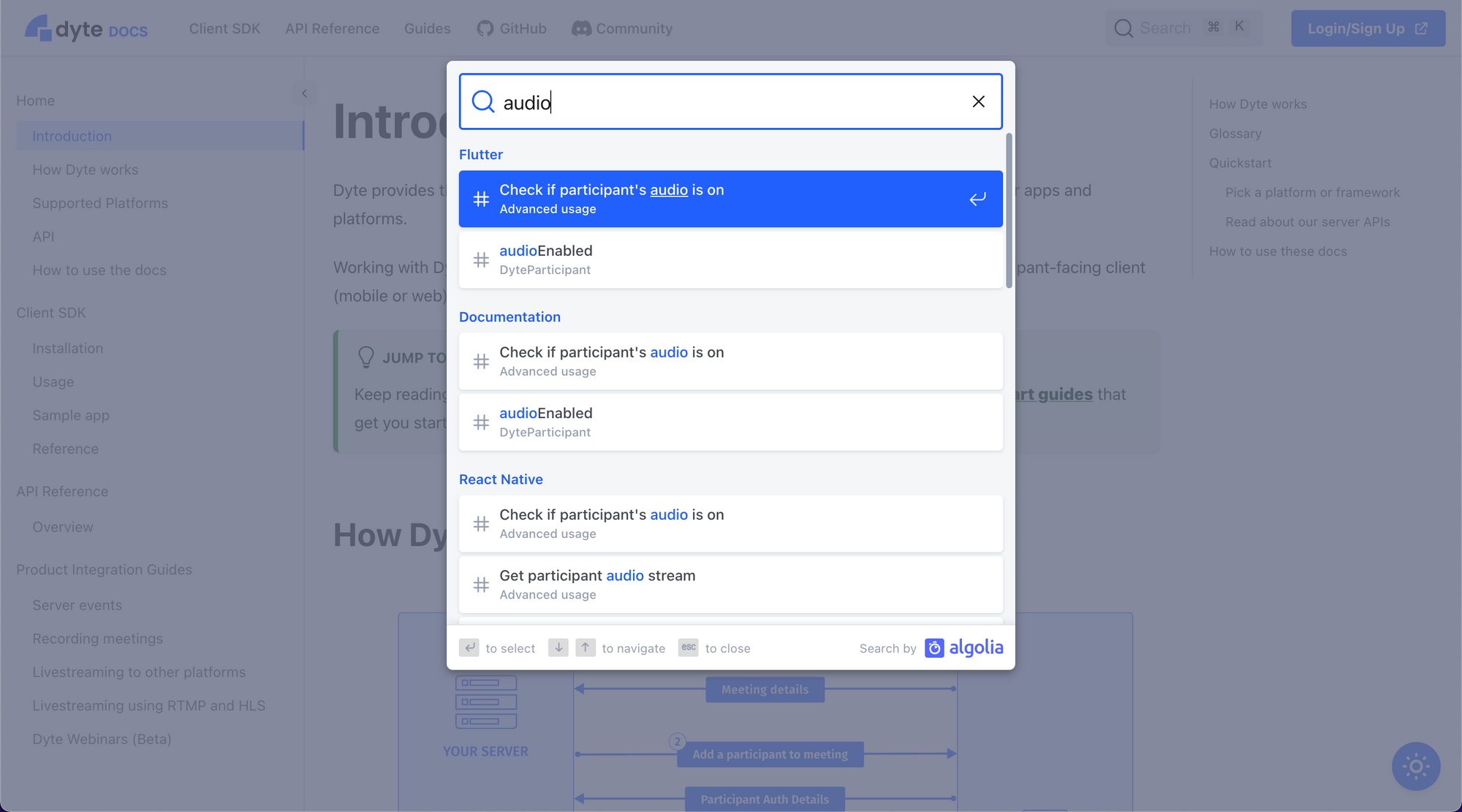
Search becomes an essential feature when dealing with large volumes of text like ours. Whenever the developer gets lost or just wants to jump directly to a specific section, or wants to know if and how we offer a certain feature - they can immediately do so using the search box.
API reference
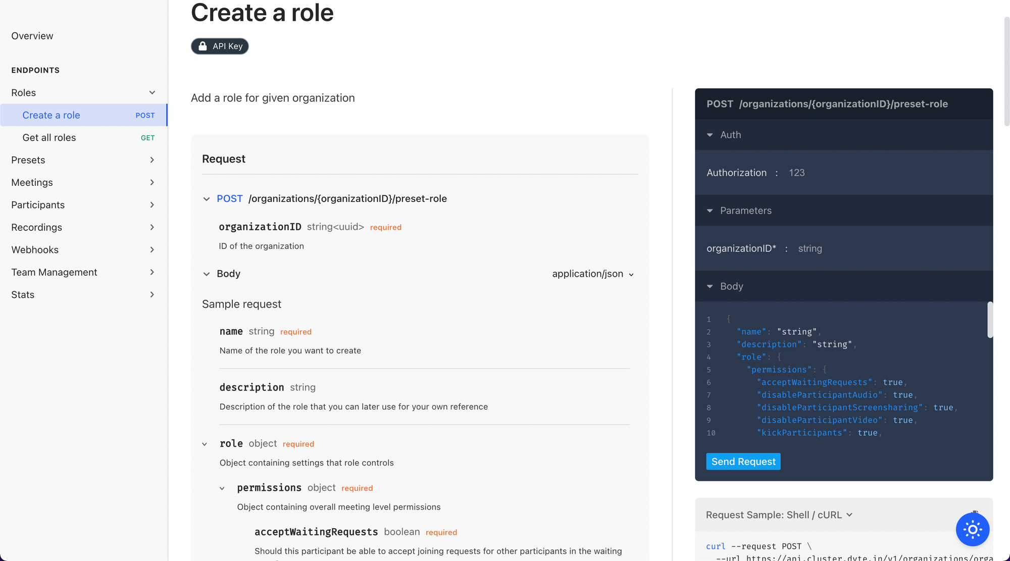
For the kind of services we provide via our products, integration is required both at the front-end via our SDKs as well as at the back-end via our Web (HTTP) APIs. To this effect, it becomes equally important for us to have an illustrative and detailed API reference too.
Samples and snippets
While the guides and references provide developers with all the information they need, they don't necessarily help them get the work done quickly. Having code snippets and sample implementations that can readily be copy-pasted improves your documentation's utility multifold.
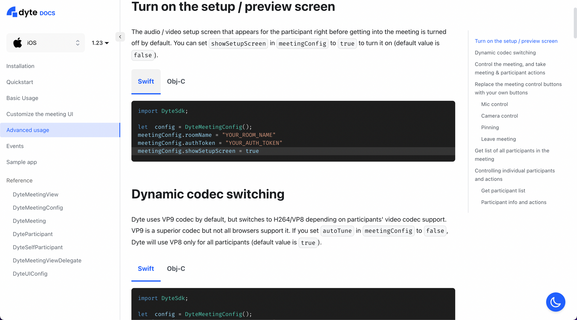
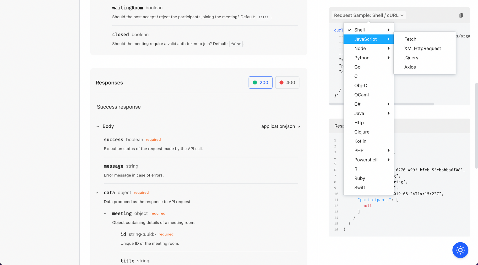
To top all this, we have also implemented sample apps for all our platforms, to demonstrate the working of Dyte's products and help developers with their integration, for the most common use cases. The links to these samples can be found under the respective platform's docs, and the apps can be used as templates to start building further on or simply copy-paste the relevant bits.
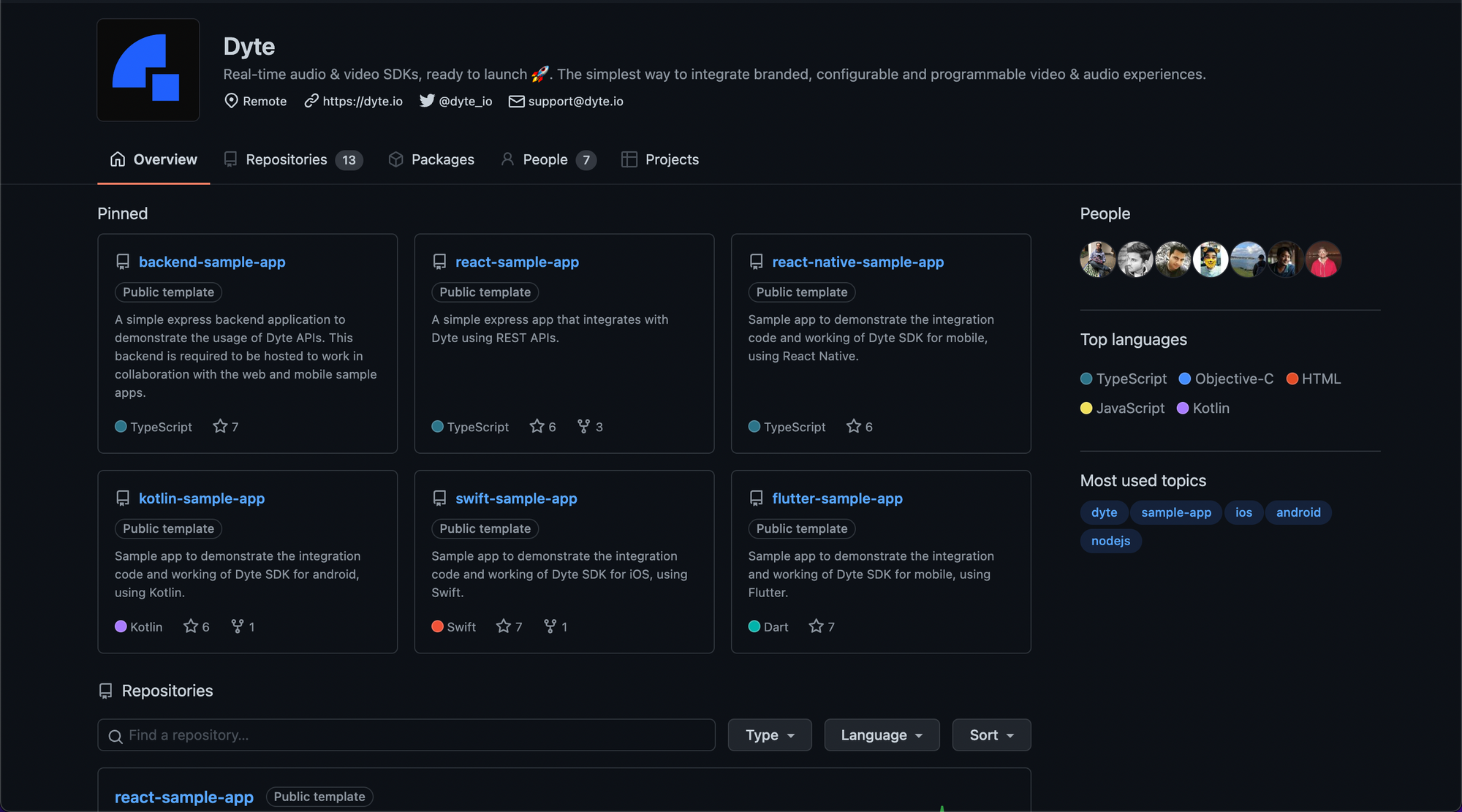
Head over to our GitHub page to find the sample that is relevant to you and star the repo to keep getting notified on further updates.
Guides
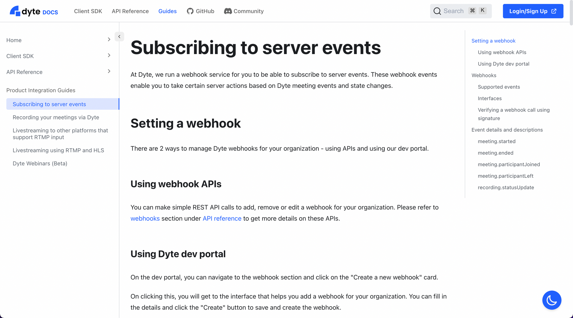
At times, it is also important to put out longer content for the developers for various reasons. Maybe you want to handhold them through steps to achieve a certain outcome, or you want to publish a recommended way to use a specific feature, or you want to explain the requirements and implications of a particular part of the product. In cases like this, guides come in handy and should be considered a must-have feature for any good documentation website.
Bonus 1: API runner
Any half-decent web API reference/documentation can immediately be made into a great API reference with the simple addition of an API runner. This allows the developers to run your APIs on the spot, while reading through the documentation, to get a better sense of the kind of input and output they should expect. They can also be used for quick testing, or even just as one-time operations that don't necessarily require a developer to write code for.
While providing examples is useful, everyone's use case is different, and having a runner integrated with the reference helps the developers to understand what their own particular thing would look like, kind of like a personalized test suite for them to use against your APIs.
Bonus 2: dark mode!
Don't we all love dark mode? Some of you might say "no" to that (or the more corporate-y "it depends" 🙄), but that's okay too. We honor your wishes, same as we honor those who want to see things as darker than they really are (getting too philosophical here, I know). We built a handy, floating button, visible at all times, to immediately switch between dark and light themes across the website. Pick your comfortable reading colors, and get in the zone!
Get started!
With the above principles and methodologies in mind, we have poured months of effort into bringing you our new documentation website. Head over to https://docs.dyte.io and check out what we have built.

As always, we are here to listen to your feedback or improvement suggestions (or the appreciation too, really). Let us know what you feel at dev [at] dyte.io!

