When we talk about responsive design in the context of web development, the first thing that often comes to mind is media queries. Media queries have been the workhorse for designers and developers looking to create responsive websites for years. They allow us to tailor our CSS based on various device characteristics, such as width, height, or screen resolution.
However, as web design has evolved and component-based architecture has become more prominent, the need for a more granular approach to responsive styling has emerged. Enter container queries.
What are Container Queries?
Container queries, sometimes called element queries, allow styles to be applied based on the size of a parent container rather than the viewport or device size. In essence, it enables us to create components responsive to their parent's size, not just the size of the window or screen.
Why are Container Queries Important?
Media queries work beautifully for page layouts on a macro scale. They enable designers to switch between multi-column and single-column layouts, adjust typography, or make other global changes based on the viewport's size. But what if you need a component to adjust its design based on where it's placed and the size of its container?
Imagine a card component. If placed in a wide sidebar, you might want it to be horizontal, with the image on the left and the text on the right. But if the same card component is placed in a narrow column, you might want it to be vertical, with the image on top and the text below.
Using only media queries, achieving this effect would be complex and unfeasible since media queries respond to the viewport, not the container. This is where container queries shine. With them, that card component can adapt its design based on its parent's size, making it truly reusable and adaptable across different layouts and placements.
Relevance to UI Component Libraries (like our UI Kit)
UI component libraries, such as those used with React, Vue, or Angular, have surged in popularity recently. The modular nature of these libraries makes it imperative for individual components to be agnostic of their surroundings.
How Container Queries Work
To use container queries, you first need to define a container. This is done using the container-type property on an ancestor element:
.parent {
    container-type: inline-size;
}
Once you have a container, you can write container queries inside a component that query the size of this container:
.child {
     /* Default styles */
     background: gold;
     margin: 12px;
     padding: 8px 8px 8px 8px;
}

@container (min-width: 400px) {
	.child {
  	    /* Styles when parent is at least 400px wide */
           margin: 48px;
           padding: 8px 16px 8px 16px;
           max-width: 450px;
           background: greenyellow;
	}
}
You can target any parent container, not just the immediate one.
Container Queries and Web Components
Web components (with ShadowDOM), which encapsulate markup and styles, pair naturally with container queries. However, web components do not encapsulate parent container information, so a Component A with its shadow root, having a child Component B with its own shadow root, can still infer the container size of its parent (which is excellent).
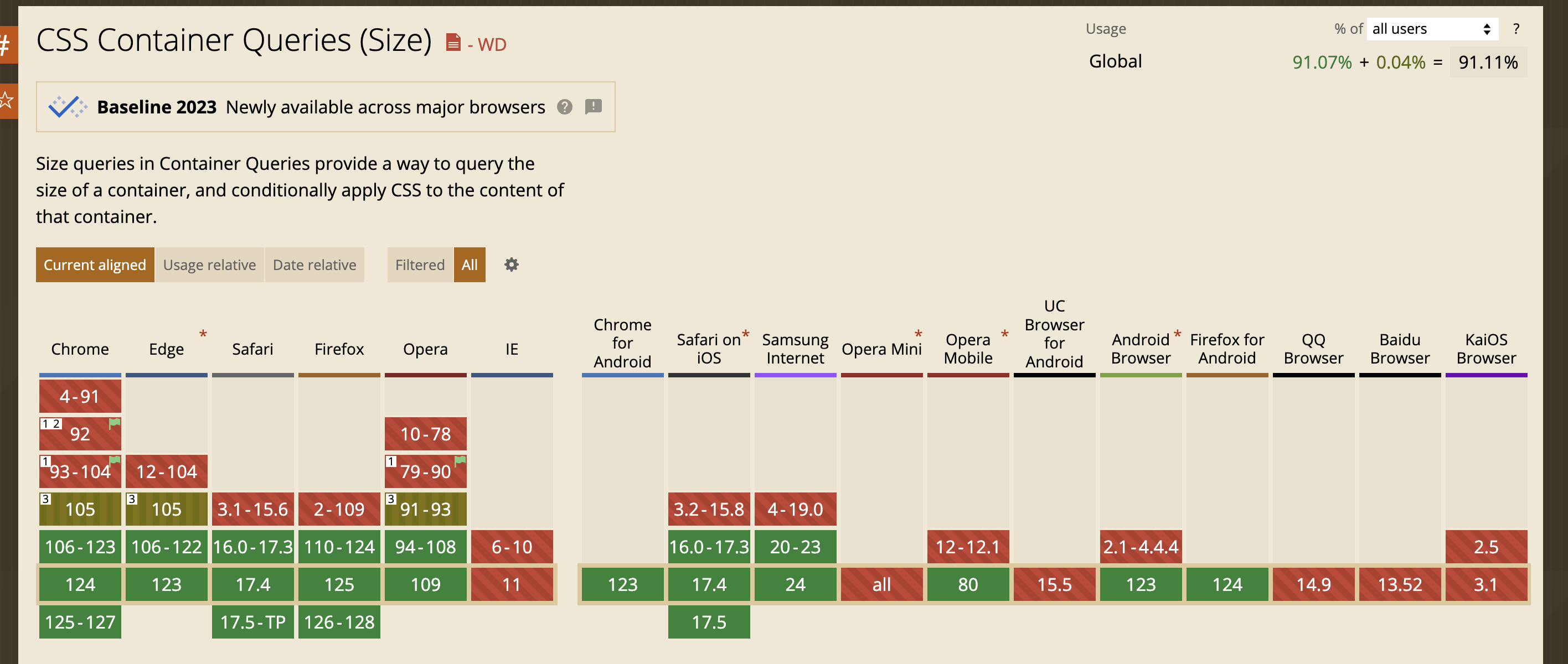
Browser Support: Can I use it?
Container queries initially landed in Chromium-based browsers but are now available in all major browsers. If you want to target non-latest Chromium browsers, JavaScript polyfills are available, like container-query-polyfill, to handle unsupported browsers. Internally, these polyfills use ResizeObserver to monitor the parent component's dimension.
Support in our Web UI Kits
Dyte's Web UI libraries (React, Angular, and Web Components) earlier handled responsiveness using two ways
- Media Queries - While flawed, it allowed us to approximate how an element could be sized.
- Explicit configuration - All our components supported a
sizeattribute/prop propagated to all children, allowing developers to set a size variant explicitly.
Explicit configuration worked in a lot of cases; however, it had flaws:
- The approach passed the control (and therefore the blame) to the developers. Developers had to use JavaScript, monitor elements, and pass us the right size.
- Encoding various heights and widths into discrete-size configurations is not as good as the more fine-grained control that container queries provide.
With these flaws, we have been slowly adopting container queries in more of our elements, keeping Media Queries and size configuration as a backup. Look at the chat example below.
Wrapping Up
Container queries are an exciting addition to web designers' and developers' toolkits. They offer a more granular and adaptable approach to responsive design, especially relevant in the era of component libraries. As the web continues to evolve, tools like container queries ensure that we can create more flexible, robust, and user-friendly interfaces. If you're working on or with UI component libraries, now's the time to dive deep into container queries and leverage their potential.
We hope you found this post informative and engaging. If you have any thoughts or feedback, please reach out to us on LinkedIn and Twitter.
Stay tuned for more related blog posts in the future!
If you haven't heard about Dyte yet, head over to dyte.io to learn how we are revolutionizing communication through our SDKs and libraries and how you can get started quickly on your 10,000 free minutes, which renew every month. If you have any questions, you can reach us at support@dyte.io or ask our developer community.


