About three months back, we launched Dyte Docs - our first documentation site built in-house. We were overwhelmed by the response it received post-launch. People across domains appreciated the website, whether it be our own customers or other developers who stumbled upon it.
People at Docusaurus really liked the design and the implementation of our unique Section Switcher. Consequently, it made its way to the Docusaurus Showcase and is listed as one of the favorites!
One of the unique features we added to the Docusaurus site was a Section Switcher dropdown, which allows you to seamlessly switch between different sections/contexts easily without losing track of the “context” of the current page.
Apart from this, some folks even messaged us about how we implemented Stoplight Elements and made it our own by styling it to match our theme.

So, we heard you! We’ve open-sourced Dyte Docs! 🎉
Not only that, this post will guide you through what we did, how we did it, and how you can do it too!
If you are looking to create your documentation site and your requirements are similar to ours:
- A robust and extensible documentation engine
- Multiple sections (with versioning in each) which have similar context
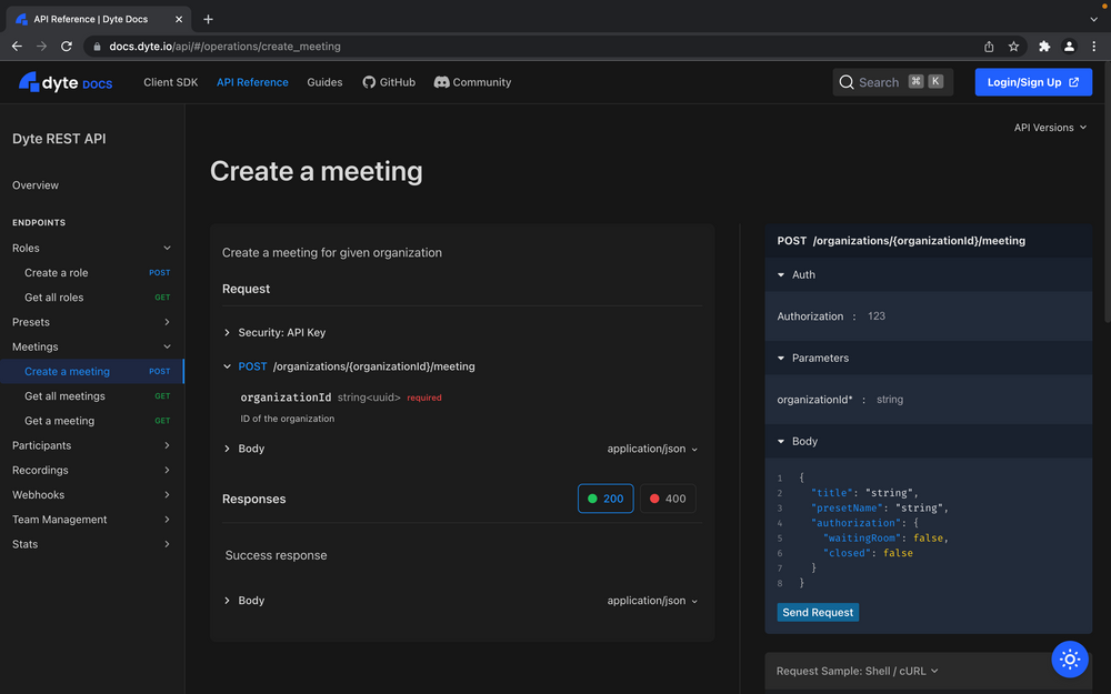
- API Reference
- Styling Docusaurus with Tailwind CSS
then this blog post is for you!
Under the Hood
Before creating our own documentation site, we used a third-party documentation site provider. About a year ago, we had just started up and were a small team, so it made sense to use a third-party service as we wouldn’t have to spend time building everything from scratch, also, we had other crucial things to do.
But as the team gradually increased, managing documentation became tricky and expensive for us.
Not only that, the service provided a very minimal scope of customizing the UI, and we had to often write weird HTML and JS hacks to have our way with the UI/UX.
So it only made sense that we created our own documentation site, as per our needs. Additionally, it would be one more place where our designers could pour their hearts out and highlight the fact that at Dyte even our Docs are a part of our product, being a developer-focused company. After looking at a bunch of options, we decided to use Docusaurus, as it is not only a widely used documentation site generator but also really extensible.
Section Switcher
Adding the section switcher component was quite easy.
All you had to do was swizzle the DocSidebar component and add the component which we made: ContextSwitcher and Docusaurus’ VersionDropdown to the top of the Sidebar.
The logic was pretty straightforward and easy to implement thanks to Docusaurus’ APIs. Here’s a small snippet which sums up the logic used in the ContextSwitcher.
const ContextSwitcher = () => {
  const [context, setContext] = useState(CONTEXTS[0]);
  // Docusaurus' API
  const data = useAllDocsData();
  const history = useHistory();

  useEffect(() => {
    const [doc] = getCurrentPageInfo();

    const currContext = getContext(doc);
    if (currContext && currContext.id !== context.id) {
      setContext(currContext);
    }
  }, []);

  const handleChange = (newValue) => {
    setContext(newValue);

    const [, ...docPath] = getCurrentPageInfo();

    const newDoc = newValue.id;

    let path = `/${newDoc}/${docPath.join('/')}`;

    const lastVersion = data[newDoc].versions.find(
      (version) => version.isLast === true
    );

    if (pathExists(path, lastVersion)) {
      // navigate to same document in the last version
      // append hash to path for navigating to anchor tags, if they exist
      if (window.location.hash) path += window.location.hash;
      history.push(path);
    } else {
      // navigate to the main doc of the last version.
      const { mainDocId } = lastVersion;
      history.push(`/${newDoc}/${mainDocId}`);
    }
  };

  // render UI
}
Context Switcher
Styling
For styling, we used Tailwind CSS, a utility-first CSS framework - because I absolutely love designing with Tailwind!
Though, it was tricky to use Tailwind in Docusaurus because Docusaurus has its own CSS, which would be overridden with Tailwind’s preflight styles. We didn’t want this, so we had to disable its preflight styles and write some more CSS classes than we would've usually written with the default setup.
Here’s how to do it: You’ll have to add the css file as a client module in your docusaurus.config.js:
// docusaurus.config.js
module.exports = {
  // ...
  clientModules: [require.resolve('./src/css/tailwind.css')],
}
You’ll also need to add a docusaurus plugin which will add the tailwindcss plugin to PostCSS.
const tailwindPlugin = (context, options) => {
  return {
    name: 'tailwind-plugin',
    configurePostCss(postcssOptions) {
      postcssOptions.plugins = [
        require('postcss-import'),
        // not required, but useful for writing nested CSS
        require('tailwindcss/nesting'),
        require('tailwindcss'),
        require('autoprefixer'),
      ];
      return postcssOptions;
    },
  };
};
Also don’t forget to add tailwind.config.js to the root of the project, and you’re done!
API Reference
One of our requirements was that we wanted everything in one place, so our users wouldn't have to go back and forth for an API runner or reference page. We also wanted it to be appealing and customizable so that it looked like a part of our Docs. Therefore we used Stoplight Elements, an interactive API docs component. But it wasn’t as customizable, so we had to write some more css like the following to customize it’s UI.
.sl-overflow-x-hidden.sl-overflow-y-auto.sl-flex-1.sl-w-full.sl-px-24.sl-bg-canvas {
  background-color: var(--docs-color-background);
}
We know it isn't the best practice, but we really didn’t want to fork the entire stoplight elements project and customize it to our needs. Thus, we took a shortcut. Also, it was tricky to use Elements because Docusaurus does SSR, so we had to add plugins to polyfill some modules to make it work.
To make Elements work with Docusaurus, we had to use the <BrowsersOnly /> only component. Check out the code here.
Adding this will throw a bunch of webpack related errors, add this Docusaurus plugin to solve them:
const webpackPlugin = (context, options) => {
  return {
    name: 'webpack-plugin',
    configureWebpack(config) {
      return {
        module: {
          rules: [
            {
              test: /\\.m?js/,
              resolve: {
                fullySpecified: false,
              },
            },
          ],
        },
        plugins: [
          new ProvidePlugin({
            process: require.resolve('process/browser'),
          }),
        ],
        resolve: {
          fallback: {
            stream: require.resolve('stream-browserify'),
            path: require.resolve('path-browserify'),
            buffer: require.resolve('buffer/'),
          },
          alias: {
            process: 'process/browser.js',
          },
        },
      };
    },
  };
};
Make sure to install these packages too: stream-browserify process buffer path-browserify
How you can make it your own!
Check out the README to see how you can make it your own and how you can add your own content to it.
We also have a de-dyte branch, a simpler version of the main docs.
Contributions Welcome!
If you liked our Docs and are working on it, or you are a customer who spotted a flaw in our docs, please feel free to make contributions by forking the repository and raising a PR.
Feel free to reach out to us on our Discord server for any queries.


