Web components (or Custom Elements) is a set of standardised APIs that allow you to create reusable and encapsulated components for the web. Custom elements allow you to define your own HTML elements and their behaviour using JavaScript. This means you can create your own custom elements like <my-element> and define their behaviour using JavaScript.
It has been around for quite some time now, but it hasn’t gained notable traction in the frontend world as most are still quite unfamiliar with it, although it’s being widely used in top websites such as YouTube, GitHub and many more.
There are many benefits to using Web Components, such as:
- Send minimal JavaScript over the wire - As it uses standard Web APIs, you don’t have to send bigger JS bundles over the wire which exceed your application bundle size, as you do with React/Angular.
- Style encapsulation - Web components’ styles can be encapsulated in its isolated “Shadow DOM”, therefore any of your global styles will not affect how your component looks and vice-versa.
- Reusability - Once you create a web component, you can reuse it anywhere across different projects and platforms.
- Performant - For simple components which don’t require too many DOM manipulations, web components are pretty performant compared to their small bundle size as they just use low-level DOM utilities. Also, third-party web component libraries work on top of these APIs to provide performance improvements for bigger, complex components too.
Before we dive deeper into web components, let’s understand the core terminologies or APIs.
- Shadow DOM: Shadow DOM allows you to encapsulate the HTML and CSS of a web component, preventing it from being affected by the styles and behaviour of the rest of the page. This means you can create your own custom styles for your web components without worrying about them being overwritten by the styles of the rest of the page.
- HTML Templates: HTML templates allow you to define a piece of HTML that can be reused across different web pages and web applications. This means you can define a piece of HTML like a navigation bar and reuse it across different web pages and web applications without having to rewrite the code each time.
Here is a minimal counterexample from webcomponents.dev:
<script>
  const template = document.createElement('template');
  template.innerHTML = `
      <style>
        * {
          font-size: 200%;
        }

        span {
          width: 4rem;
          display: inline-block;
          text-align: center;
        }

        button {
          width: 4rem;
          height: 4rem;
          border: none;
          border-radius: 10px;
          background-color: seagreen;
          color: white;
        }

      </style>

      <button id="dec">-</button>
      <span id="count"></span>
      <button id="inc">+</button>`;

  class MyCounter extends HTMLElement {
    constructor() {
      super();
      this.count = 0;
      // attaches Shadow DOM in "open" open
      this.attachShadow({ mode: 'open' });
    }

    connectedCallback() {
      this.shadowRoot.appendChild(template.content.cloneNode(true));
      this.shadowRoot.getElementById('inc').onclick = () => this.inc();
      this.shadowRoot.getElementById('dec').onclick = () => this.dec();
      this.update(this.count);
    }

    inc() {
      this.update(++this.count);
    }

    dec() {
      this.update(--this.count);
    }

    update(count) {
      this.shadowRoot.getElementById('count').innerHTML = count;
    }
  }

  customElements.define('my-counter', MyCounter);
</script>

<my-counter></my-counter>

Let’s look at the parts of the above code snippet in detail to further understand web components a bit better.
First, we’ve written the actual content inside a <template> tag. This element allows you to write a markup template which isn’t actually rendered on the page so that the contents can be reused anywhere on the page. There is also a similar tag: <slot> which is a placeholder inside a component where you can drop in your own content, kind of like how you pass children in React and slots in Vue, but the difference is that it creates separate DOM trees and presents them together.
Next, we define our custom element by extending HTMLElement and initialise the component inside the constructor(). We also attach a Shadow DOM to the component in the constructor: this.attachShadow({ mode: 'open' }) in the open mode, which means the elements inside this Shadow DOM are accessible from outside the shadow root. Whereas in a closed mode, access to elements is denied from outside the shadow root. You access the shadow root with this.shadowRoot.
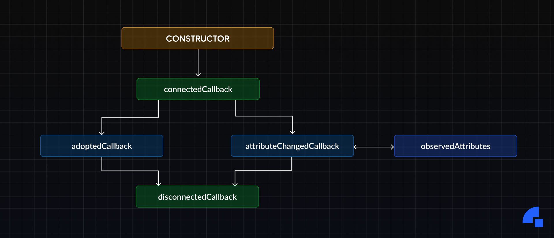
And like other frameworks (take React, for instance), Web Components also have its life cycle callbacks like: connectedCallback(), disconnectedCallback(), attributeChangedCallback() and adoptedCallback(). Here’s a brief explanation of each of these:
connectedCallback()- Called when the component is first connected to the DOM.attributeChangedCallback(name, oldVal, newVal)- Called when an attribute to the component changes.adoptedCallback()- Called when the component is moved to a new document.disconnectedCallback()- Called when the component is disconnected from the DOM.
In our example, we initialise the DOM with the content we defined in the template, and we attach event listeners to our DOM nodes which mutate the state on user interaction, and then finally we initialise the state in the DOM with this.update().
Finally, we register the created element in the CustomElementRegistry with a specific tag name, so we can start using it in the DOM.
customElements.define('my-counter', MyCounter);
Note that custom elements tag names should be at-least two words separated by hyphens, so that they don’t conflict with any new HTML elements that are created in the future.
Though, there are some limitations of Web Components too:
- They will not work on really old browsers, but the support in most browsers is pretty good now.
- Newer technologies like SSR (Server Side Rendering) aren’t supported by default as web components are mostly made to run on the client side.
- You can only pass strings to attributes of a web component.
You can easily overcome these limitations with the help of a web component library.
Web Component libraries
While you can write web components without the need for a third-party library, there are some libraries out there which help us to write Web components much more easily and provide other features and performance improvements on top of the standard APIs, such as StencilJS, Lit, FAST to name a few.
Here’s a quick walkthrough through the above-mentioned libraries to learn their differences:
- Lit adds reactivity to web components using declarative templates (using lit-html) which reduces boilerplate code and enhances your DX. It is really lightweight, and it doesn’t use a Virtual DOM.
- FAST is also a lightweight solution to writing web components and similar to Lit it also doesn’t use a Virtual DOM and you write templates with tagged template literals. You can type the templates as well in FAST.
- Stencil is a compiler that generates Web Components. It combines the best concepts of the most popular frameworks into a simple build-time tool. Unlike the other two options mentioned, Stencil does use a lightweight Virtual DOM like React called snabbdom underneath to enhance performance, but it is a lightweight VDOM implementation. Also, Stencil uses JSX templating syntax, and a Stencil component’s code looks very similar to a React class component.
What’s common among all these libraries is that they allow you to write in TypeScript and provide similar APIs.
What we chose at Dyte
We did experiment with a wide range of libraries, and decided to use Stencil for the following reasons:
- Stencil provided a DX which we were all comfortable with
- JSX templating (as most of us on the team know our way around React)
- Easy TailwindCSS integration for our design system
- Write code in TypeScript, so there’s type safety.
- Easy integration with other frameworks like React and Angular.
- Stencil is small and also performant as it uses the platform when it can!
- It also provides a great developer experience out of the box.
Unlike other libraries, Stencil components don’t extend HTMLElement like we saw in the counter-example. The reason which Stencil states is:
HTMLElementlocks source code to only work in the browser, rather than keeping the logic free from any APIs. The Stencil compiler is able to optimize many versions of components for various output targets, and one way to make that easier is by keepingHTMLElementout of it.
Cross framework support
While web components theoretically should work anywhere, there isn’t full support for leveraging it in its entirety in some frameworks like React and Angular, while it does work really well in recent frameworks like SolidJS, Svelte & Vue which come with better Custom Elements support.
However, React is bringing full web component support (passing props and handling events), and it’s currently in the experimental stage, so until it fully reaches stable, we’re gonna have to find a way to use our components in React apps!
You can check out Custom Elements support in various frameworks here: https://custom-elements-everywhere.com/#react.
Luckily Stencil provides easy ways to create component wrappers for frameworks like React and Angular. This nice guide helped us to create a React UI Kit package, which adds wrappers over our web components and exports React components. They have similar guides for Angular as well.
I created a Stencil Monorepo starter which has all the things you need to start shipping UI Kits for Vue, React and Angular. You can check it out here: https://github.com/vaibhavshn/stencil-monorepo-starter.
We have an example component my-component in the Stencil core package, which can be found at packages/core.
When we build the core package, you’ll see that a React component MyComponent is auto-generated in this file: https://github.com/vaibhavshn/stencil-monorepo-starter/blob/main/packages/react-library/src/components/stencil-generated/index.ts. Similarly Angular and Vue components are also generated in their respective paths.
Finally, we can build the individual React, Angular and Vue libraries and ship them.
Styling
Regarding styling our UI Kit components, we use a custom design system so our customers get the most customisation options possible, and we use TailwindCSS to have a single source of truth for our design tokens which we can use anywhere across our components, which made our CSS highly maintainable and configurable.
Setting it up is pretty straightforward as Stencil supports postcss via a plugin.
Here’s how you can set it up.
First, install the packages:
npm i @stencil-community/postcss tailwindcss autoprefixerThen, to create Tailwind’s config file, run:
npx tailwindcss init
Now, we need to configure Stencil to use TailwindCSS via the postcss plugin in stencil.config.ts:
export const config: Config = {
	// ...
	plugins: [
    postcss({
    	plugins: [
			require('tailwindcss'),
			require('autoprefixer')
		],
    }),
  ],
}
Since each Stencil component has its own css file, you’ll need to use it @apply directive or the theme() utility in the css files instead of using utility classes in your markup, like this:
:host {
	color: theme(colors.gray.800);
    /* or */
	@apply text-gray-800;
}
Now you can define your design tokens in a central tailwind.config.js file and use it in every component easily.
Challenges
There were, however some challenges that came along with using Stencil.
We noticed there was a memory leak related to DOM elements happening, and after debugging found out that Stencil wasn’t cleaning up detached DOM nodes properly. We’ve notified the team about it and it is being looked at.
Also, Stencil components are lazy loaded for performance. However, there is a drawback to it. As our application has a lot of interactive components, whenever you render a component for the first time, it doesn’t render straight away, rather we have to wait for the component code to load over the network (using dynamic imports) and then it will render. There is a slight lag. Stencil had this with their dist-custom-elements-bundle output, but they’ve deprecated that in favour of the dist-custom-elements output. We have found a way around this where we inline dynamic imports, and now our components are loaded immediately and render fast too.
Documenting the components
Another cool thing about Stencil is that it comes with support for generating documentation from JSDoc and other documentation files.
Here’s how you would normally document a component with Stencil.
import { Component, Prop, h } from '@stencil/core';

/*
 * A component which tells you your name
 */
@Component({
  tag: 'my-first-component',
})
export class MyFirstComponent {
  /** Name of the user */
  @Prop() name: string;

  render() {
    return (
      <p>
        My name is {this.name}
      </p>
    );
  }
}
Like this, you can write documentation for a component, its properties, events and methods.
Once you’ve written the documentation, you can generate the documentation in various formats with the various docs output targets that Stencil provides. You can choose among json, readme or custom outputs.
We chose the json format because we wanted more control over how to showcase our documentation on our documentation site.
Here’s the documentation page for the DyteSimpleGrid React component. You can see it here: https://docs.dyte.io/react-ui-kit/components/dyte-simple-grid
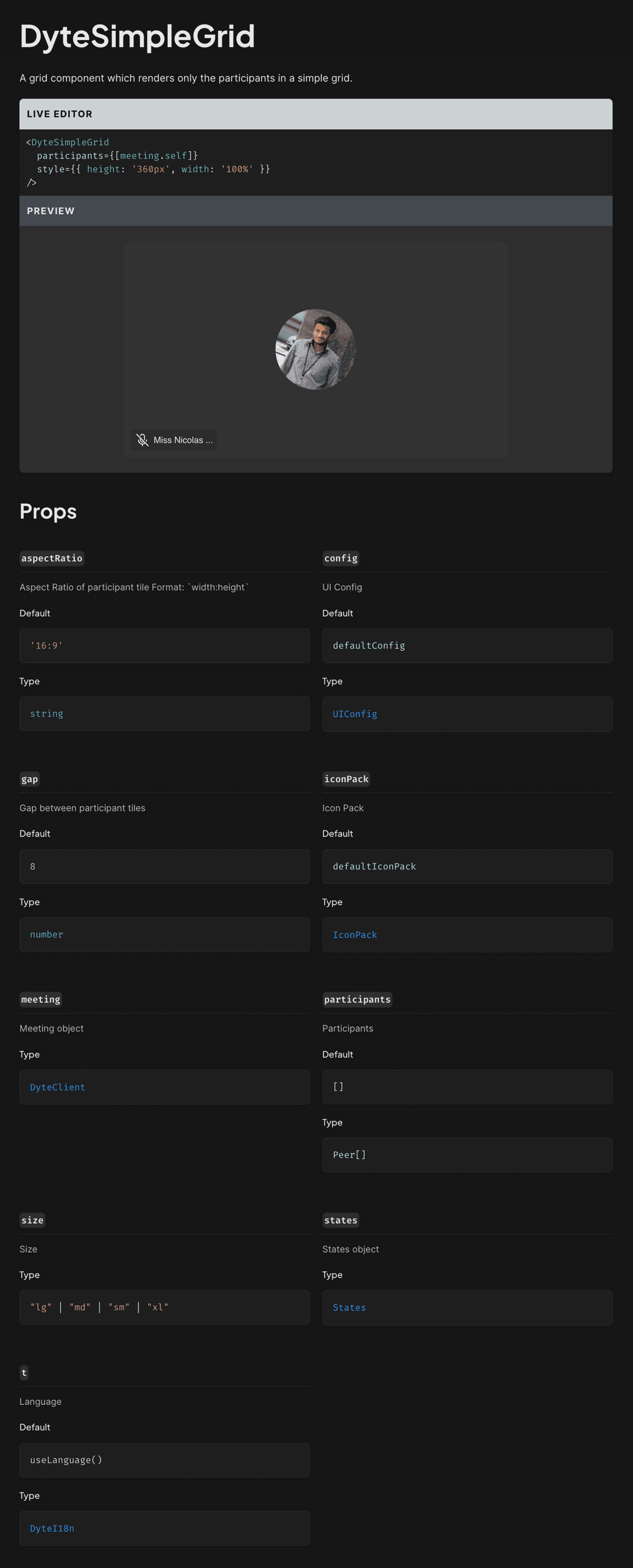
The above image showcases how we show documentation for our DyteSimpleGrid component.
Also, note that the examples for each UI Kit — React UI Kit and Angular UI Kit — are different. We wrote framework-specific usage examples in the files: usage/react-example.md, usage/html-example.md.
Then Stencil reads these files and outputs them in the docs output file, and we use that to generate framework-specific documentation in our docs site.
We wrote a custom script for our docs which processes data from the Stencil output and generates documentation for HTML, React and Angular UI Kits!
Also, we show Live Previews for our React UI Kit documentation so users can play around with our components right in the documentation!
Now, all we have to do to update our documentation is to just write it along with the source code, and then just install the updated ui-kit package in our docs and our documentation auto-updates! 🎉
Conclusion
So to conclude, most of our customers are currently using our UI Kit, and we’ve got some great responses from them about how easy it is to use and configure.
Moreover, we’re still trying to push the boundaries and are exploring new ways to bring more customisation to our offerings, so stay tuned!
If you haven't heard of Dyte yet, go to https://dyte.io to learn how our SDKs and libraries revolutionize the live video and voice-calling experience. Don't just take our word for it; try it for yourself! Dyte offers free 10,000 minutes every month to get you started quickly. If you have any questions or simply want to chat with us, please contact us through support or visit our developer community forum. Looking forward to it!


