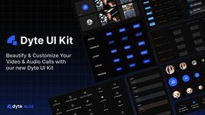
After months of designing, planning, and hard work, we’re thrilled to announce the release of our UI Kit 🎉
In this blog post, we’ll take a closer look at how the UI Kit is what it is and how you can use it in your projects seamlessly!
Planning and Design of UI Kit
Learning from the feedback of our existing users, we quickly realized that what they really needed was a UI Kit - a set of components each made to serve a specific smaller purpose in a meeting that can be combined as per their needs, not a huge monolith component which loads the whole meeting for us with little customization.
And thus, we started work on two separate projects: web-core and this one, the UI-kit.
Web-core handles all the low-level media and network handling parts of a meeting and exposes simpler APIs for us to use. UI Kit then uses these APIs from the meeting object. To know more about the web-core project, read the blog post here.
The meeting object or members of this meeting object are used internally in our UI components to run specific logic.
Dyte UI Kit is made using web components, and they use Shadow DOM which makes the styling of each component isolated, so the CSS on your page doesn’t interfere with the styling of components.
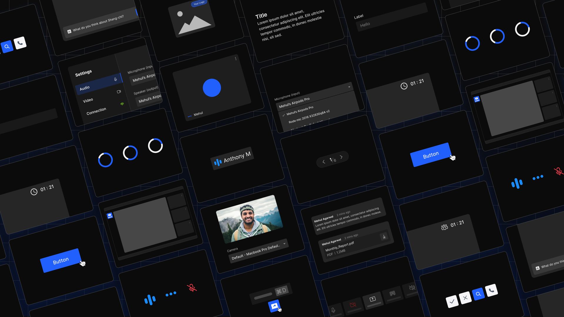
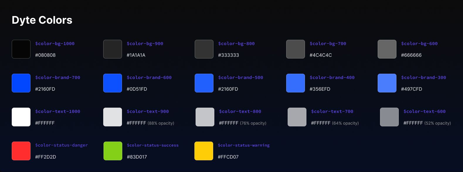
As we were making a set of UI components, we had to have a shared language among them so that they can be easily customized, with very little effort. Thus we used Design Tokens so that every component uses similar and shared values, which can all be tweaked with a single line of code, like a flip of a switch!
Design Tokens
Every component uses design tokens with the help of CSS variables for styling so they can be easily customized.
- Spacing tokens are used for everything from the sizing of elements, margins, padding, and positioning.
- Colors are also applied to components with the help of tokens as well so they can match your brand’s identity perfectly.
- The font family is also set with the help of a design token, so you can swap out whichever font you need seamlessly.
- There are tokens for border widths, border radius as well. We provide a set of options for each of these.
Taking customization to the next level
Icon Pack and i18n support
Apart from these design tokens, we’ve also tried to improve on the customization options available, with features like Internationalisation (i18n), and Icon Packs Support!
Each component that renders text or shows icons, will accept an iconPack and t (i18n helper method) props that are used to render the icons and text. By default, it uses our default icon pack and default language (English). An icon pack object is basically an object consisting of a key which is the icon name and the value which is just the SVG string of that icon.
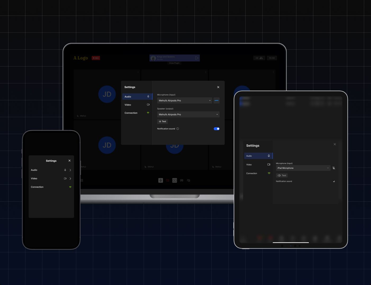
Accessibility and Responsiveness
And while building each component, we’ve also put emphasis on accessibility (a11y) so that users can easily navigate through the UI without the need for moving their mouse across the screen! Every element is screen reader friendly, and most images have an alt tag as well.
Whether it is to close your dialogs with the Escape key or navigate through the visual elements by clicking the Tab key, we’ve taken care of a lot of things.
In terms of responsiveness, each component that is responsive would have a size property that takes in either sm, md, lg or xl.
Here are the default breakpoints that we’ve used:
| Breakpoint | Width |
|---|---|
| sm | 700px |
| md | 1280px |
| lg | 1920px |
| xl | 2160px |

Now, to get a better understanding of using the UI Kit, let’s build a simple meeting UI step-by-step.
We’ll be using the React UI Kit along with React Web Core for the examples, do note that there are the ui-kit (plain web components) and angular-ui-kit packages as well which you can use according to whichever one is most suitable to you.
We also have some sample apps to get you started:
Making a simple meeting UI
Let’s go step-by-step to build a simple and pleasant meeting UI.
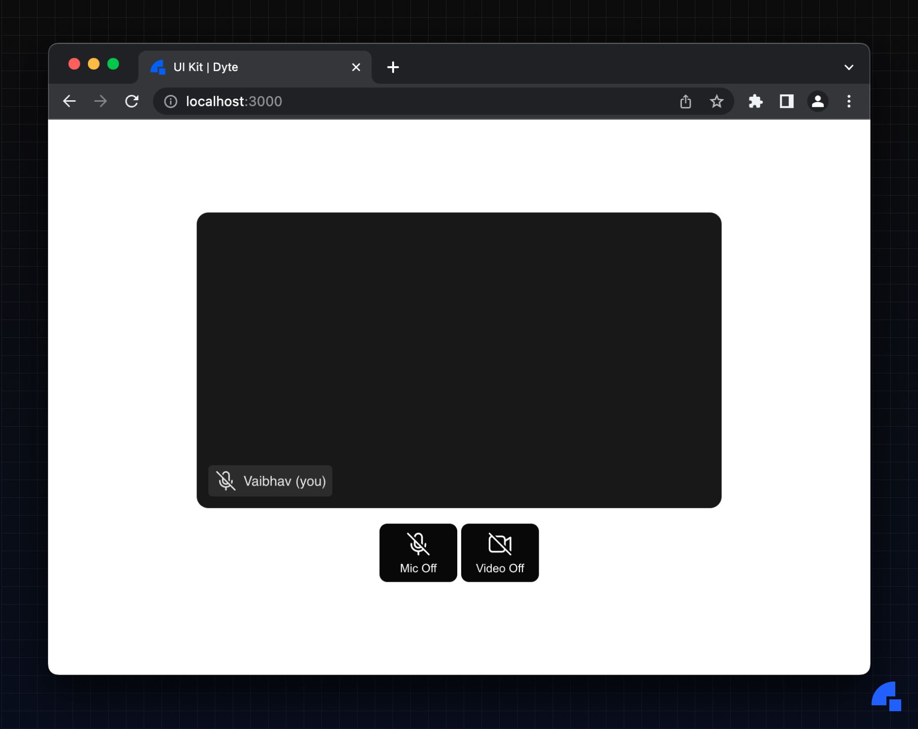
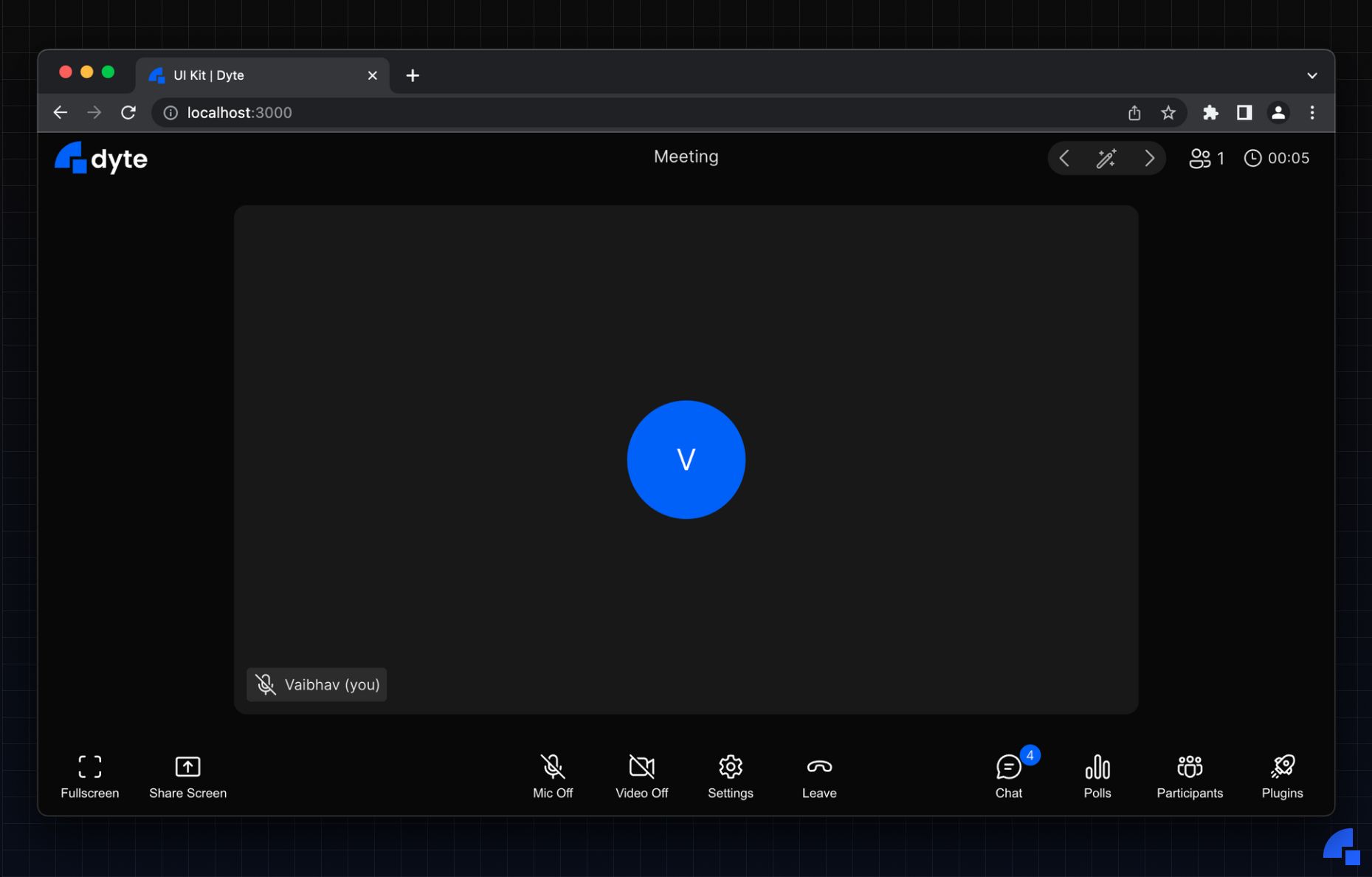
1. Simple Self View with Toggle buttons
Let’s start building a simple meeting UI by rendering your own video in a ParticipantTile component and with the ability to toggle your audio and video with the toggle components.
Code:
export default function Meeting() {
  const { meeting } = useDyteMeeting();

  return (
    <div className="container">
      <DyteParticipantTile participant={meeting.self}>
        <DyteNameTag participant={meeting.self}>
          <DyteAudioVisualizer participant={meeting.self} slot="start" />
        </DyteNameTag>
      </DyteParticipantTile>

      <div className="actions">
        <DyteMicToggle meeting={meeting} />
        <DyteCameraToggle meeting={meeting} />
      </div>
    </div>
  );
}
The meeting object as mentioned earlier is received from the web-core package. In this React example, we are using the react-web-core package which makes using web-core in React very easy with the help of easy-to-use hooks!
Each component either accepts a participant or meeting prop depending on what the component does.
The UI for the above would look like this:
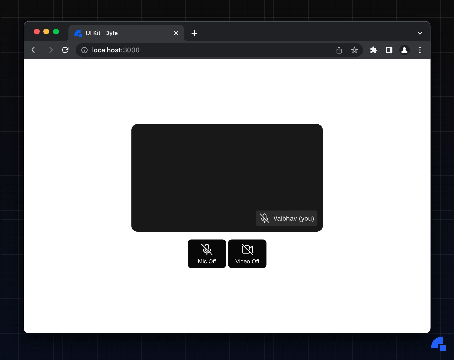
Quick tip: You can change theslotproperty on DyteAudioVisualizer toendif you want to have the audio visualizer at the end of the name-tag.
We offer a plethora of customization options even in components! For instance, you can change the name tag’s position with the nameTagPosition prop.
If we set it to bottom-right, the UI would look like this:
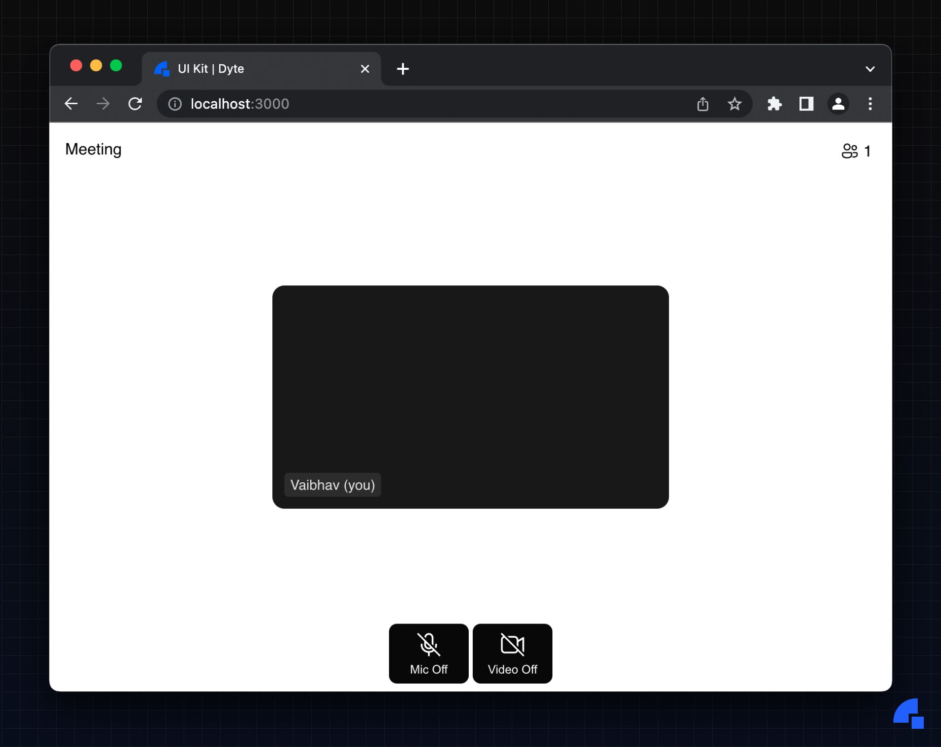
2. Rendering a basic header, stage, and control-bar layout
Basically, any normal meeting UI would have these basic three elements: header, stage, and the control bar.
We will render some basic metadata components in the header, such as showing the meeting title and the participant count.
Code:
<div id="header">
  <DyteMeetingTitle meeting={meeting} />
  <DyteParticipantCount meeting={meeting} />
</div>
Now, to render the active participants list in a grid inside the stage. We’re rendering grid inside the stage, just so that we can add a sidebar to this stage in the next steps.
const activeParticipants = useDyteSelector(
  (meeting) => meeting.participants.active
);

return (
    <div id="meeting">
			{/* Header here */
      <div id="stage">
        <div id="grid">
          {activeParticipants.toArray().map((participant) => (
            <ParticipantTile participant={participant} meeting={meeting} />
          ))}
          <ParticipantTile participant={meeting.self} meeting={meeting} />
        </div>
      </div>
    </div>
);
What is this ParticipantTile component, you may ask? Well, it’s just a component that renders the entire ParticipantTile layout as we saw in the previous example, just re-using the code.
function ParticipantTile({ participant, meeting }) {
  return (
    <DyteParticipantTile participant={participant} className="participant-tile">
      <DyteNameTag participant={participant} meeting={meeting}>
        <DyteAudioVisualizer participant={participant} />
      </DyteNameTag>
    </DyteParticipantTile>
  );
}
Now, for the control bar, we’ll just render the MicToggle and CameraToggle components like in the previous example.
With some nice styling, the UI would look like this:
3. Adding Audio!
So now, you will now only be able to see the participants in the grid, but you would not be able to hear them. To hear them, we have another component called DyteParticipantsAudio component which handles audio for all participants, screen-shares in a single component.
<DyteParticipantsAudio meeting={meeting} />
That’s it!
4. Adding Chat in a Sidebar
Next, we’ll add a ChatToggle component that toggles the visibility of the Chat component in a sidebar. To do this, we’ll use the Events emitted from the Toggle button and use them to render the sidebar.
export default function Meeting() {
  const [states, setStates] = useState({ activeSidebar: false, chat: 'none' });
  const meetingEl = useRef();

  // Dyte hooks here

  useEffect(() => {
    const onStateUpdate = (e) => {
      setStates({ ...states, ...e.detail });
    };
    meetingEl.current.addEventListener('dyteStateUpdate', onStateUpdate);

    return () => {
      meetingEl.current.removeEventListener('dyteStateUpdate', onStateUpdate);
    };
  }, []);

  return (
    <div id="meeting" ref={meetingEl}>
			{/** Header here */}
      <div id="stage">
        <div id="grid"></div>
        {states.activeSidebar && (
          <div id="sidebar">
            <DyteSidebar meeting={meeting} states={states} />
          </div>
        )}
      </div>
      <div id="controlbar">
        <DyteChatToggle meeting={meeting} states={states} />
      </div>
    </div>
  );
}
I've added the DyteChatToggle component to the control-bar, which will emit an event when clicked. We listen to this event on the parent meetingEl element in the useEffect and update our states object. This states object is then used to render the sidebar, then we just pass along the states object to it so that it renders just the chat component.
NOTE: You don't need to manage the states object manually for passing it around to components as it is managed by a global store.
That is it! We now have worked with events and states to toggle the visibility of components.
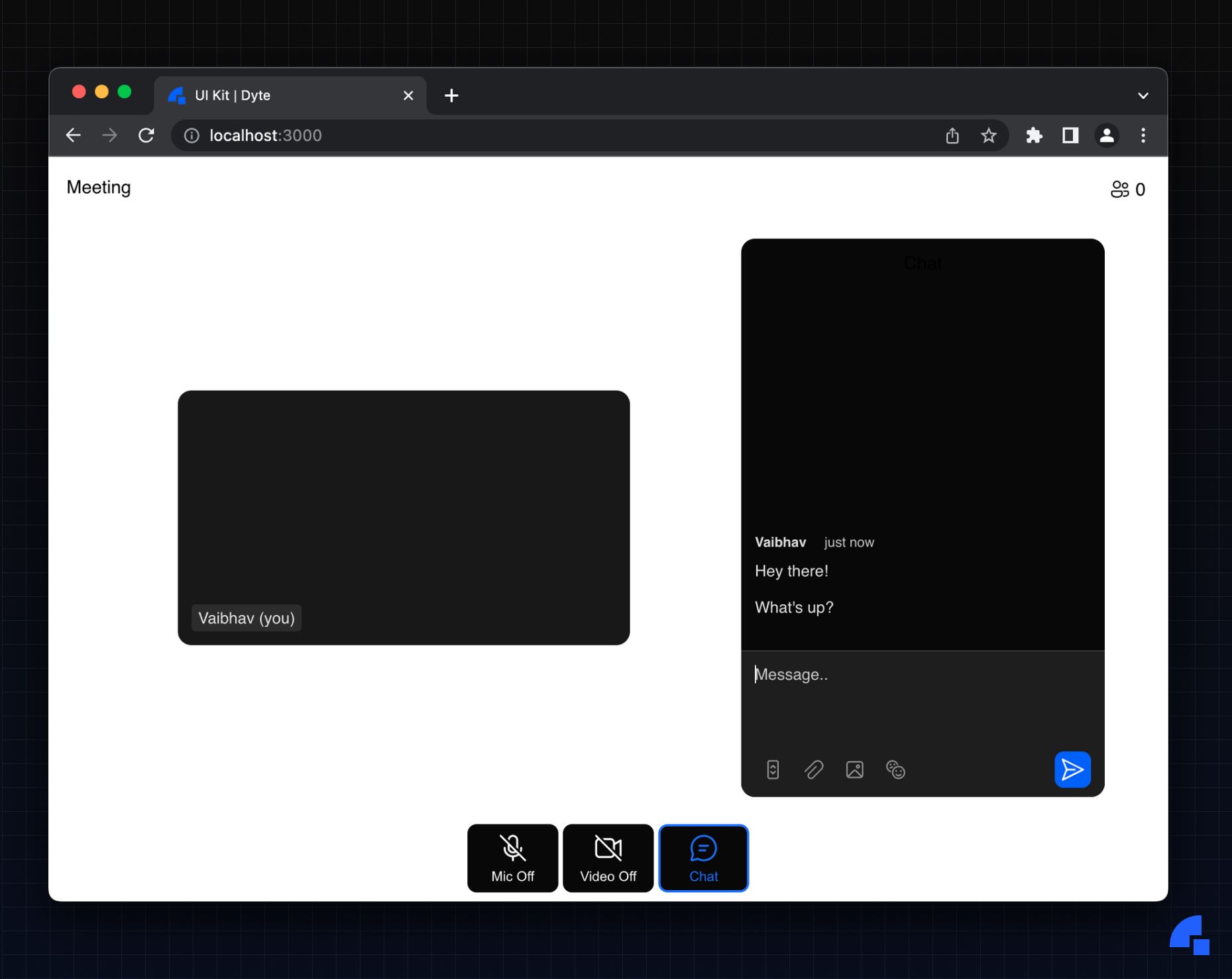
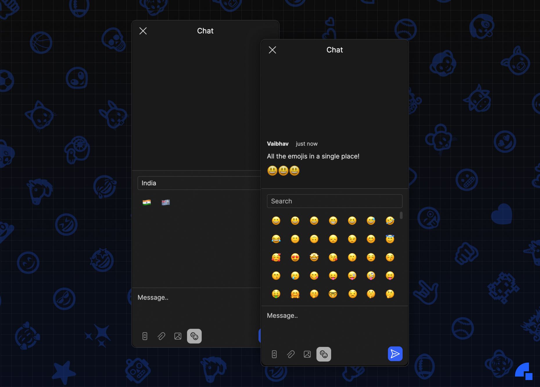
Oh, and did we tell you, you have some cool features in Chat such as:
Drag and drop or paste images/files
Autoscroll - Scroll down automatically when new messages arrive. You can disable this if you want.
Emojis
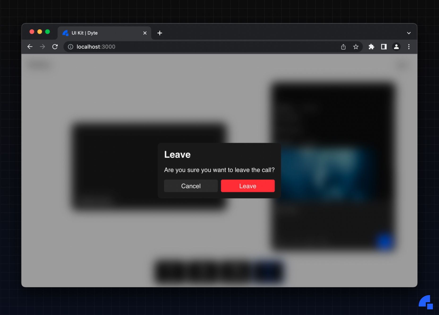
5. Leave Meeting Modal and Image Viewer
Now we have rendered some things for a basic meeting, but we still don’t have a way to exit the meeting or open up an image viewer when a user sends an image in the chat.
For dialogs/modals we have an intuitive DyteDialog component that we will use. First, let’s add the DyteLeaveButton to the control-bar which will emit the actual event.
<DyteLeaveButton meeting={meeting} />
Next, the onStateUpdate we wrote above will handle the events emitted for both the leave meeting modal and the image viewer.
So now, we just have to render the LeaveMeeting component according to the activeLeaveConfirmation state value.
{states.activeLeaveConfirmation && (
  <DyteDialog
    open
    onDyteDialogClose={() =>
      setStates({ ...states, activeLeaveConfirmation: false })
    }
    hideCloseButton
  >
    <DyteLeaveMeeting meeting={meeting} />
  </DyteDialog>
)}
Here, open is a boolean value, which is set to true here. The dialog also emits an onDyteDialogClose event which we will listen to, to update our local state to hide the modal.
That’s it!
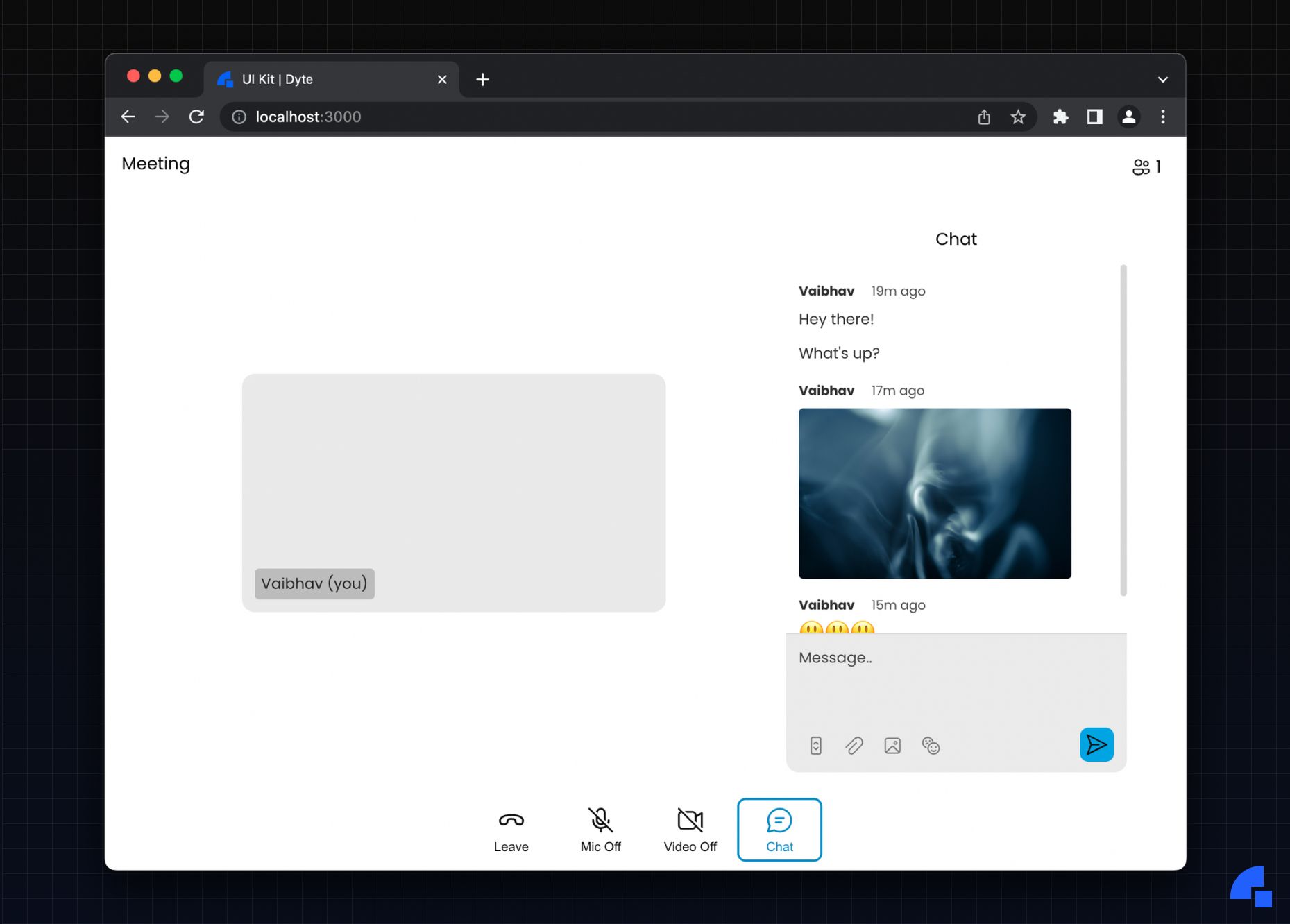
Same for the ImageViewer component:
{states.image && (
  <DyteDialog
    open
    onDyteDialogClose={() => setStates({ ...states, image: null })}
    hideCloseButton
  >
    <DyteImageViewer image={states.image} />
  </DyteDialog>
)}
6. Customising the Design Tokens
I talked at great length about design tokens at the beginning, but how do you customize them? The answer is provideDyteDesignSystem() which is a utility function, which takes in basic design tokens and applies them to an element by doing some processing beforehand so it works properly with the components.
With it, you can customize:
- Colors - Every color you see in the UI is customizable.
- Themes - The method comes with a few of the most commonly used themes such as
light,darkanddarkestwhich get applied. You can then pass in other colors separately to override these if you want. - Font Family - You have two options when it comes to fonts.
- Google Fonts - A widely used service on the web, just pass in your desired font family name and we’ll do the rest of the work of setting it up!
- Custom Font - If you have a custom font you want to use, just enter it in and load the font on your own and you’re good.
- Border Radius and Border Widths - We provide a set of options for each of these, choose one that makes the most sense for you!
To apply some design tokens, just go to the useEffect and use this utility:
provideDyteDesignSystem(meetingEl.current, {
  theme: 'light',
  googleFont: 'Poppins',
  colors: {
    brand: {
      300: '#0a78a9',
      400: '#0c8ec8',
      500: '#0ea4e7',
      600: '#26b3f2',
      700: '#48bef4',
    },
    background: {
      700: '#bcbcbc',
    },
    'video-bg': '#eaeaea',
    danger: '#ff909e',
  },
});
That is it! Easy as that.
Oh, and we left out one component, there’s also a DyteAvatar component which renders your Avatar - your picture which you have set for a user or the initials if the picture doesn’t exist.
Just add the component to the ParticipantTile component, it will look like this:
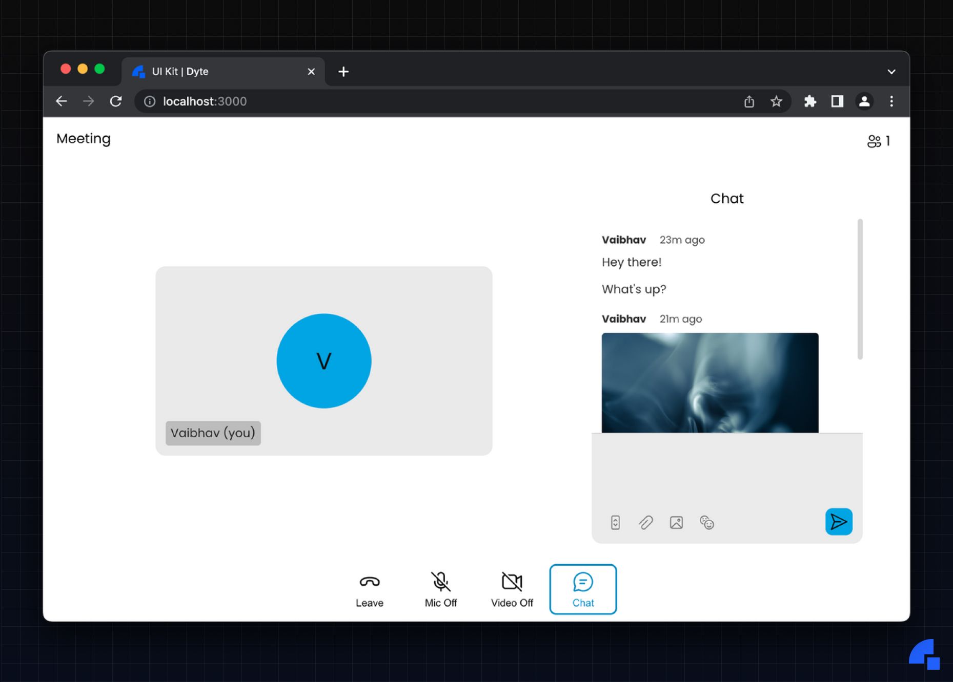
We’ve just built a basic meeting UI by using the individual components.
If you’re not a fan of using individual components or you would like to write less code with just as much level of customization of the UI, we have the powerful DyteMeeting component!
Just pass the meeting object to it and it will render the meeting UI according to your preset values.
<DyteMeeting meeting={meeting} />
It comes with all the essentials you would need in a meeting, from indicators for Recording and Live streaming, to every sidebar option available.
This DyteMeeting component is a very special component, it renders all the UI based on a simple UI Config object, nothing more.
An upcoming blog post goes in-depth into how the component renders UI from a Config returned from the Server.
If you haven’t heard about Dyte yet, head over to https://dyte.io to learn how we are revolutionizing live video calling through our SDKs and libraries and how you can get started quickly on your 10,000 free minutes which renew every month. If you have any questions, you can reach us at support@dyte.io or ask our developer community.

